The TypeTogether story: chapter 2025
- Date
- December 2025
There are many ways to mark the passing of a year; friends and loved ones seen and sometimes lost, memories made, achievements and milestones achieved. But for a type foundry such as ours, the story of 2025 can be told in so many wonderful letterforms in so many scripts with so many wonderful people in so many places. We’re thankful for the opportunity to work with you and look forward to doing great things together in the new year.
New typefaces in 2025
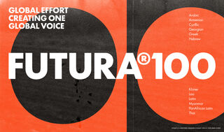
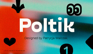
2025 saw three major new type family releases: Futura®100, our reimagining of Paul Renner’s iconic geometric script in 12 global scripts; Poltik, Patrycja Walczak’s fun and funky reversed contrast sans serif family; and Sakkal Saad, Dr Mamoun Sakkal and Aida Sakkal’s friendly, handwritten Arabic Naskh family.
Futura®100
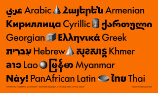
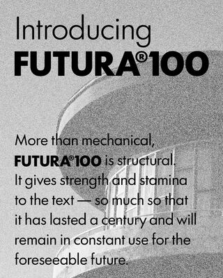
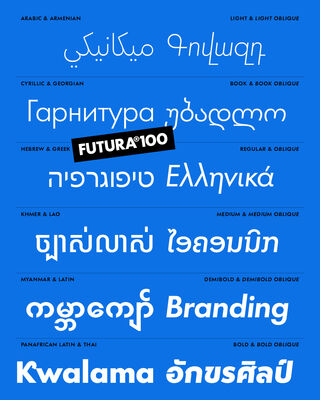
Futura®100 was a huge undertaking for TypeTogether working in partnership with Bauer Types, involving more than 30 type designers, consultants, graphic designers and experts to create the first release of 12 global scripts: Arabic, Armenian, Cyrillic, Georgian, Greek, Hebrew, Khmer, Lao, Myanmar, Latin, PanAfrican Latin, and Thai. And this was just the first release – in 2026 we will release 11 additional scripts which will include support for major Indic scripts, as well as Simplified Chinese and Hangeul, covering more than 90% of the world’s population in total.
Poltik
Patrycja Walczak’s Poltik won the Gerard Unger Scholarship in 2023, drawing upon Polish design from the 1960s and 70s. In fact, the initial inspiration came from the numbers on a clock Patrycja found in her grandfather’s drawer. And while Poltik’s display cut is a joy to behold, its reversed contrast text weights are proving to be useful across a wide range of use cases. The family is ideal for branding, signage, and packaging, presenting and updating a retro vibe.
Sakkal Saad and Sakkal Saad Poster
Dr Mamoun Sakkal and Aida Sakkal’s Sakkal Saad font family was inspired by the expressive typography of Middle Eastern newspapers, magazines, and posters from the 1960s to 1980s, and captures the vibrancy and optimism of the era while adding a contemporary twist. Sakkal Saad and Sakkal Saad Poster also make extensive use of OpenType features, stylistic sets, and contextual alternates to provide graphic designers with a wealth of options for layouts.
Custom fonts
text
Primarium
We continued work on our Primarium project to map how handwriting is taught to students in countries around the world. 2025 saw the project publish an acclaimed book, an accompanying exhibition, as well as a number of awards for the project itself as well as the two type families that emerged from Primarium’s research (details on the awards below).
The book ‘Primarium: Handwriting education across cultures and continents,’ edited by Pooja Saxena and José Scaglione, was published in late June. In addition to providing a comprehensive overview of handwriting models in numerous countries, the 360-page book is sumptuously designed and printed. A few copies are available for purchase from our web store.
Content
We published a wide variety of educational articles, interviews, and other interesting pieces on our blog. Here are some highlights from 2025.
Interviews & articles
Many companies’ pain points are in licensing typefaces and in working with multiscript typography. In connection with our Futura®100 release, we explained our approach to type licensing, and how our Futura®100 release provides companies with consistent branding, reduced administrative burden, and predictable costs. We also made the case for the benefits of multiscript typography, especially for businesses seeking to expand beyond their own borders.
We also published interviews with 2024 Gerard Unger Scholarship winner Anne-Dauphine Borione about their winning Dargon type family, inspired by the world of fantasy. “I believe typography is a fantasy, an artistic endeavour, a universe in itself,” she says in the interview. “Type enhances my reality, it is a conduit for enchanting myself, a portal to realms yet unseen. One might see type as purely utilitarian; I see it as a powerful source of magic.” We couldn’t agree more.
We also published a fascinating interview with the New Zealand artist Anton Hart, who uses our Bree typeface to create sculptural totems that spell out messages. Hart’s work takes Bree into a tangible realm, and it’s inspiring to see our type used in this way.
Type in use
What’s another word for thesaurus? One person who might know is George Frederick, the Experience Design VP for dictionary.com. They chose our LFT Etica typeface for the website’s rebrand. He goes into detail about the rebrand process in the interview, and also had this to say: “The next-level quality of the typefaces plus the value of TypeTogether’s partnership are well worth the cost.” This put some crimson in our cheeks.
Awards
We were thrilled and humbled to see the Primarium project receive such acclaim in 2025. The Primarium project itself won a gold at the European Design Award in recognition of its excellence in depth and breadth of information, as well as its simple presentation. The project also won a gold at the Indigo Awards in Digital Design for Social Change and a silver for website design (the site was done by our collaborators Elena Ramirez and Octavio Pardo at Ashler Design, and we couldn’t be prouder).
But the real star of the awards season was Playwrite, our type engine for handwriting education, which won an impressive string of awards: Premios CLAP, the TDC award, gold at Joseph Binder, gold at ED-Awards, and the yellow pencil from Design & Art Director (D&AD). What is even nicer is that both of the typefaces to emerge from the Primarium research, are available as free downloads from Google Fonts: Playwrite and Playpen Sans.
Playwrite wasn’t our only Type Directors Club winner in 2025: Emma Marichal’s Ploquine, which won the 2022 Gerard Unger Scholarship, was selected for a TDC Certificate of Typographic Excellence. Ploquine also received a merit at the Hiiibrand Awards in 2025.
Printed matter
TypeTogether produced quite a few printed works in 2025, all of them impeccably designed and printed, if we say so ourselves. In addition to the aforementioned ‘Primarium: Handwriting education across cultures and continents’, TypeTogether published a book looking back on 10 years of the Gerard Unger Scholarship. Titled ‘Letters for the future: Ten years of the Gerard Unger Scholarship’, the book features interviews with scholarship recipients and provides an introduction to their excellent work.
In terms of specimens and catalogues, typophiles will appreciate the gorgeous Adelle Constellation type specimen, which brings together all of Adelle’s variants and scripts under the theme of astronomy. We also produced trifold specimens for Atlante, Aeroplan, Chaco, and Lektorat, as well as a poster for Tablet Gothic which quotes Nobel Prize winner Malala Yousafzai.
videos
One of the joys of working at TypeTogether is seeing Dr. Cecilia Brarda’s award-winning motion design work on our new type releases. Don’t miss the videos she created in 2025 for Futura®100, Poltik, and Sakkal Saad, and many others.
Community: education, talks & workshops
We consider education to be a key part of our mission, and 2025 saw a number of activities related to the Primarium project, as well as other workshops and publishing activities. We look forward to continuing this commitment in 2025.
Gerard Unger Scholarship
For the 11th edition of TypeTogether’s Gerard Unger Scholarship, we received 49 submissions from 47 designers living all over the world — representing 27 schools in 16 countries, and two in hybrid mode (online + in-person). Thirty-one of the families were single scripts and 18 were multiscript, showcasing nine different scripts (Arabic, Bengali, Chinese, Cyrillic, Devanagari, Greek, Hangeul, Hebrew, and Latin).
The winner of the 2025 Gerard Unger Scholarship was Newz, by Manau Quellec. This demi-slab family resonated wtih the TypeTogether team, and we’re already working with Manau to release Newz.
Meetings and travels
TypeTogether is a virtual organisation, meaning that our team does not get too many opportunities to meet in person in large numbers. That is, except for our annual meeting. 2025 saw the team return to Vallfort, Spain, for an intensive but fun and incredibly rewarding week of meetings, hands-on work, relaxation, and camaraderie under the Catalan sky.
Workshops & talks
Our team was in a lot of places in 2025 for workshops and presentations. How many? Here’s a quick chronological rundown:
And that was 2025!
So as you can see, 2025 was a very productive and successful year for us, and we’re truly thankful for all of the opportunities we have received. We firmly believe the best is yet to come, and with projects on the horizon such as the release of the second half of Futura®100, Dargon, and many more projects, it’s easy to see why. If there is a throughline running through all of our activities, it is summed up by our motto: Care for Characters.
See you in 2026,
The TypeTogether team