A tailored headline voice for Garda Trentino
- Client
- Norden/Garda
- Project Year
- 2024
- Script
- Latin
- Date
- April 2024
- Type Design and Creative Direction
Go to Veronika Burian TypeTogetherVeronika Burian
- Type Design
Go to Yorlmar Campos Yorlmar Campos
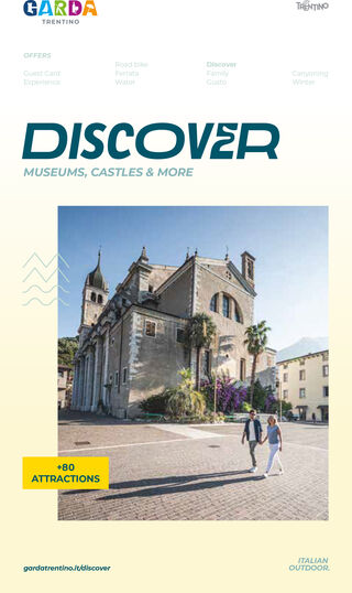
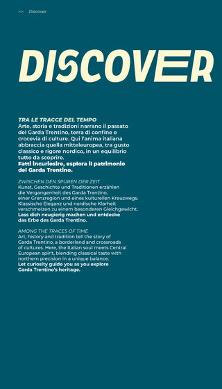
For the new visual identity of Garda Trentino, the Innsbruck-based design studio Norden commissioned TypeTogether to modify LFT Etica Condensed by Leftloft into a distinctive headline font for the region’s brand communication. The aim was to create a typeface that could carry the energy of the new claim, Italian Outdoor, while remaining practical across campaigns, digital platforms, print, events, and everyday brand applications.
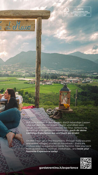
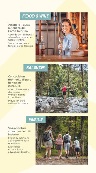
Garda Trentino occupies a uniquely expressive landscape: the northern shore of Lake Garda, framed by mountains, shaped by water, wind, rocks, historic towns, outdoor sports, and a mild Mediterranean climate. Norden’s new design direction embraced this contrast — Alpine and Mediterranean, active and relaxed, sporty and joyful. The headline font needed to become one of the key carriers of that feeling: recognisable, bold, dynamic, and closely connected to the place itself.
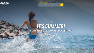
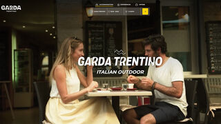
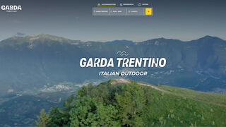

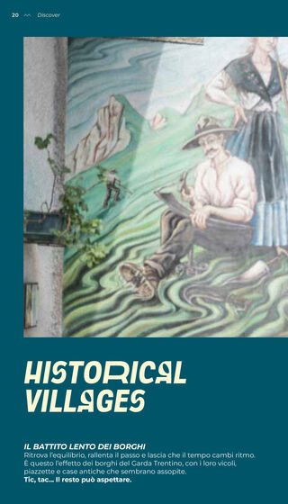
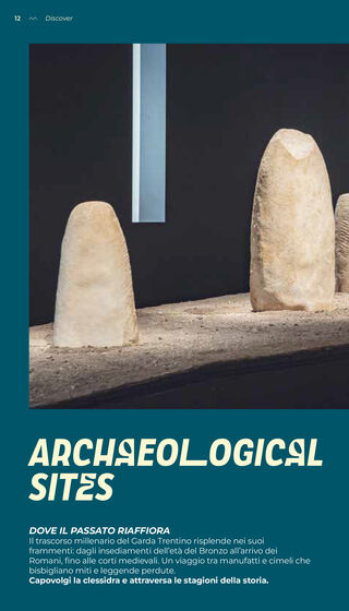
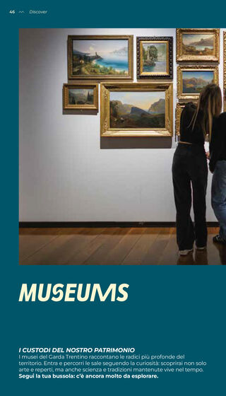
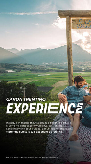
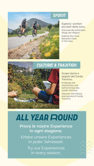
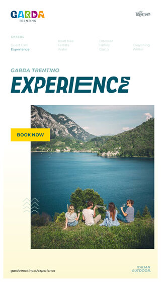
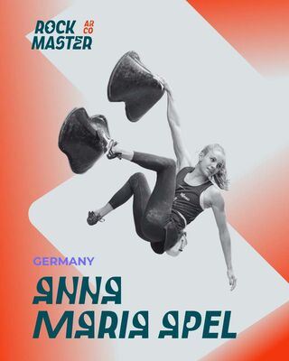
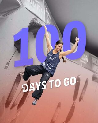
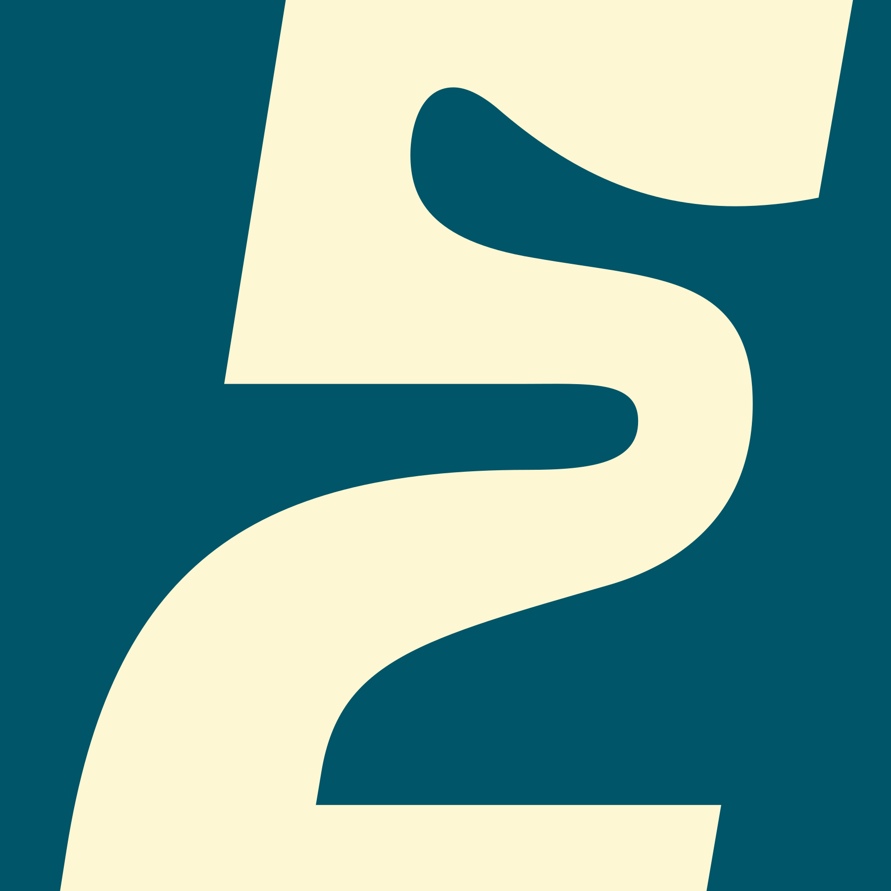
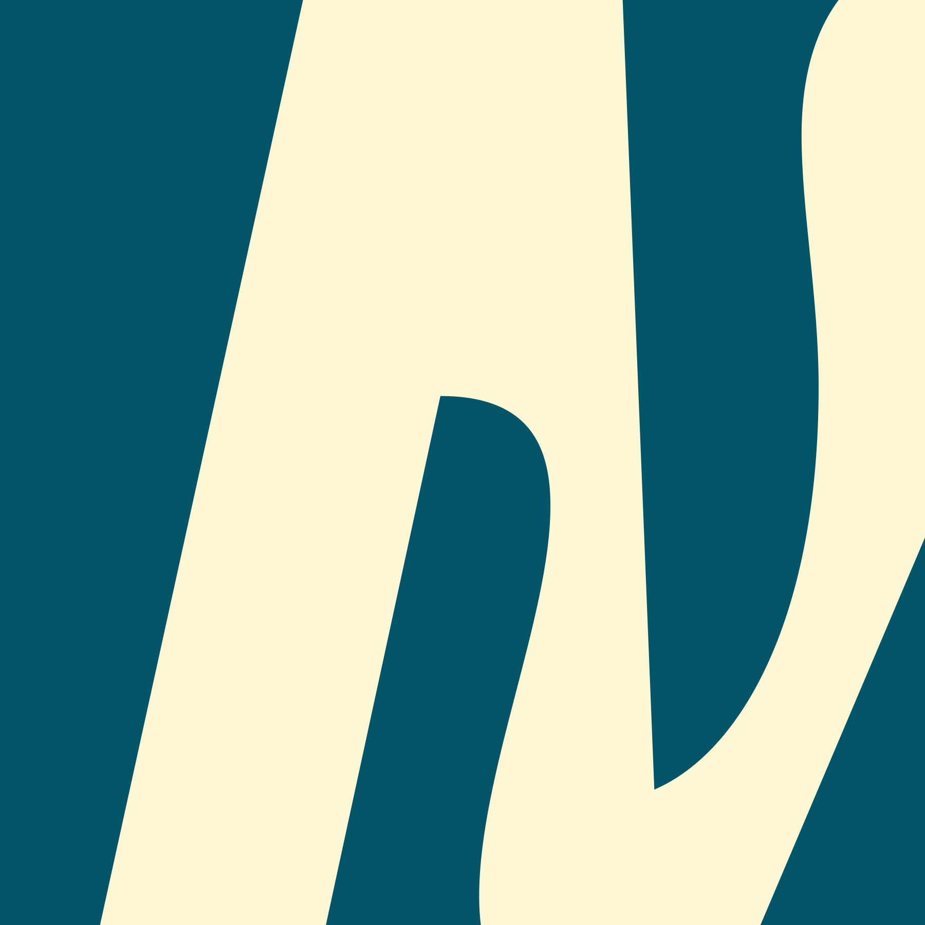
The starting point was LFT Etica Condensed Bold Italic, whose compact proportions and italic movement already suggested speed, clarity, and contemporary outdoor culture. TypeTogether’s task was to carefully push this foundation further, transforming an existing typeface into a unique brand asset. The modifications focused on selected uppercase letters, introducing changes to letter waist, occasional stretched forms, and a more expressive design across words.
A central idea of the customization was the tension between curves and edges. Rounded details bring warmth, openness, and a sense of Italian flow; sharper cuts and angular moves evoke rocks, mountain profiles, wind, waves, and physical activity. It was inspired by the GARDA logotype itself that has icons, related to Italian lifestyle, rather than regular letter counters. Instead of inserting literal icons into the letters though, the final direction aimed for a subtler typographic translation of the region — enough character to be memorable, but controlled enough to remain usable.
The result was conceived as a flexible headline system. One version allows designers to manually choose between standard and modified forms, giving them control over rhythm and emphasis in individual layouts. A second version automates the alternates for web and social media use, helping Garda Trentino maintain a lively and recognisable typographic voice even in fast-moving digital contexts.
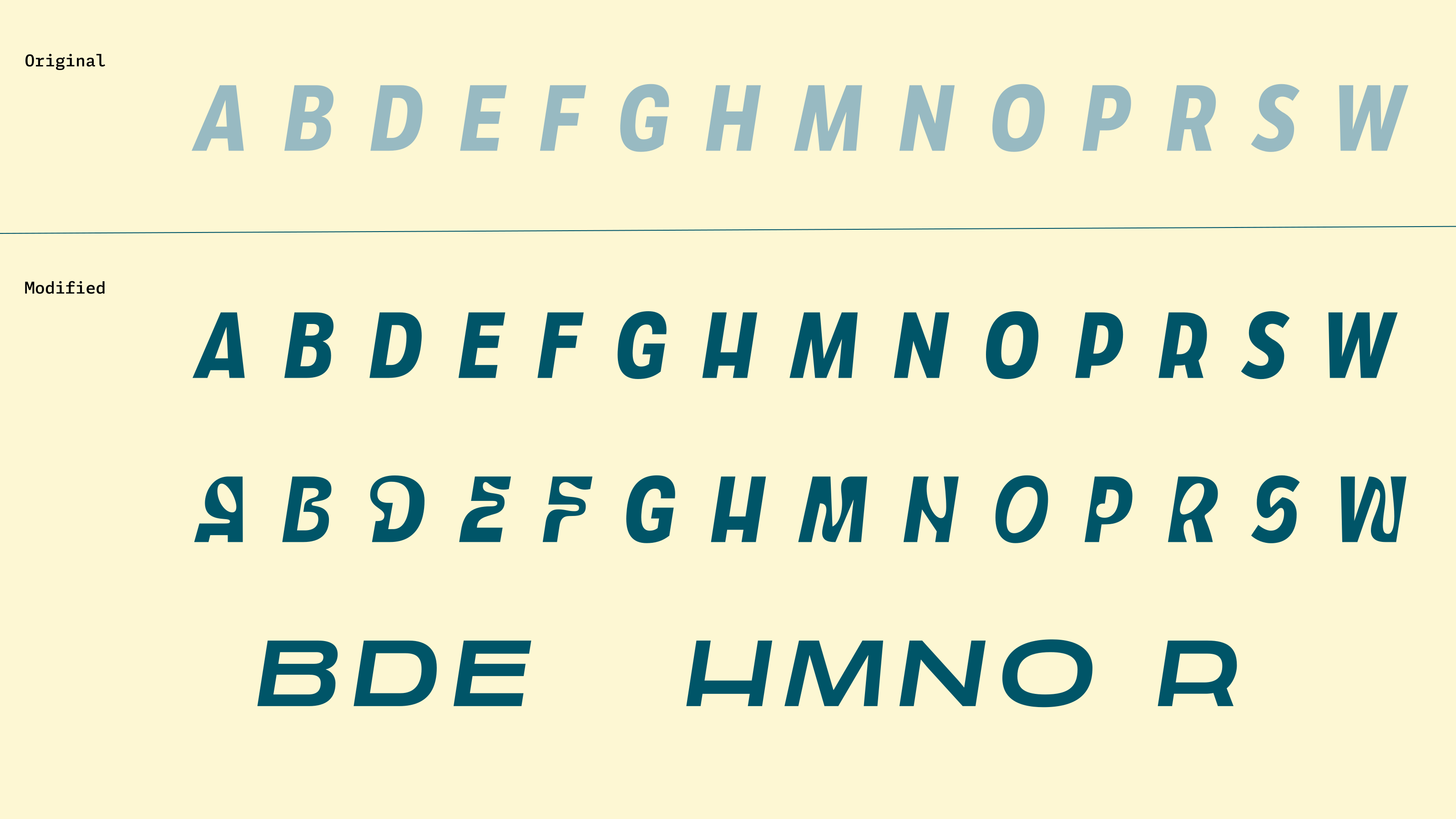
There are three levels of modifications.