Monroo
- Client
- Lemon Design
- Project Year
- 2025
- Script
- Latin
- Date
- April 2026
- Type Design
Go to Yorlmar Campos Yorlmar Campos
- Creative direction
Go to Veronika Burian TypeTogetherVeronika Burian
For the monroo visual identity, LEMON DESIGN by Štěpán Holič commissioned TypeTogether to create a customised version of Bely Display for use in the monroo logo system. Originally designed by Roxane Gataud, TypeTogether’s first Gerard Unger Scholarship winner, Bely was modified to become a distinctive headline and logo typeface tailored specifically to monroo, a specialist supplier of beauty products to hair styilists in the Czech Repulbic and Slovakia.
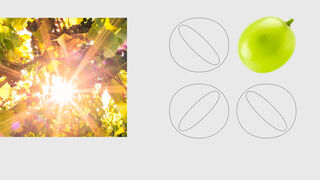
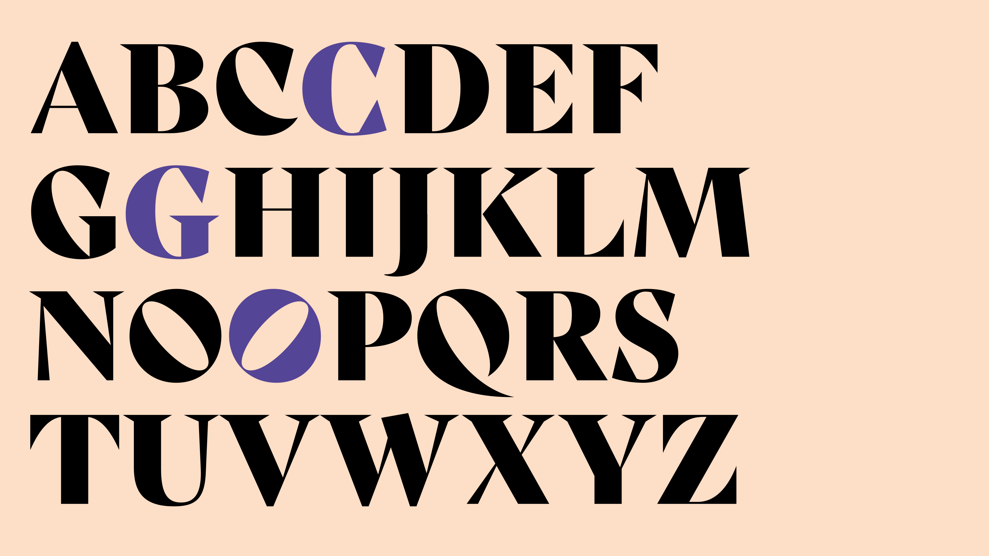
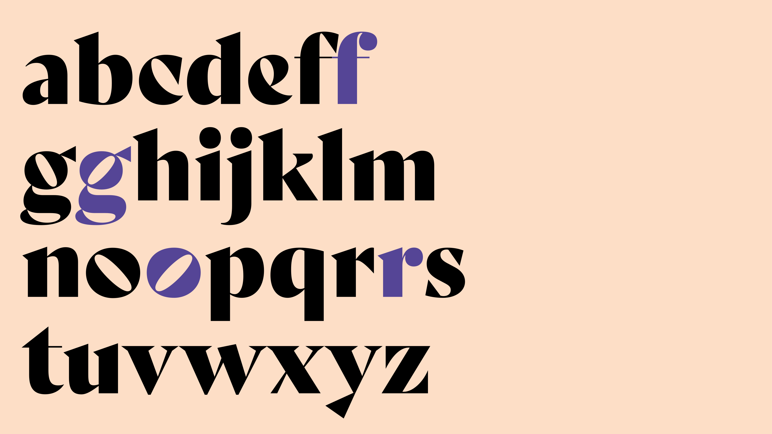
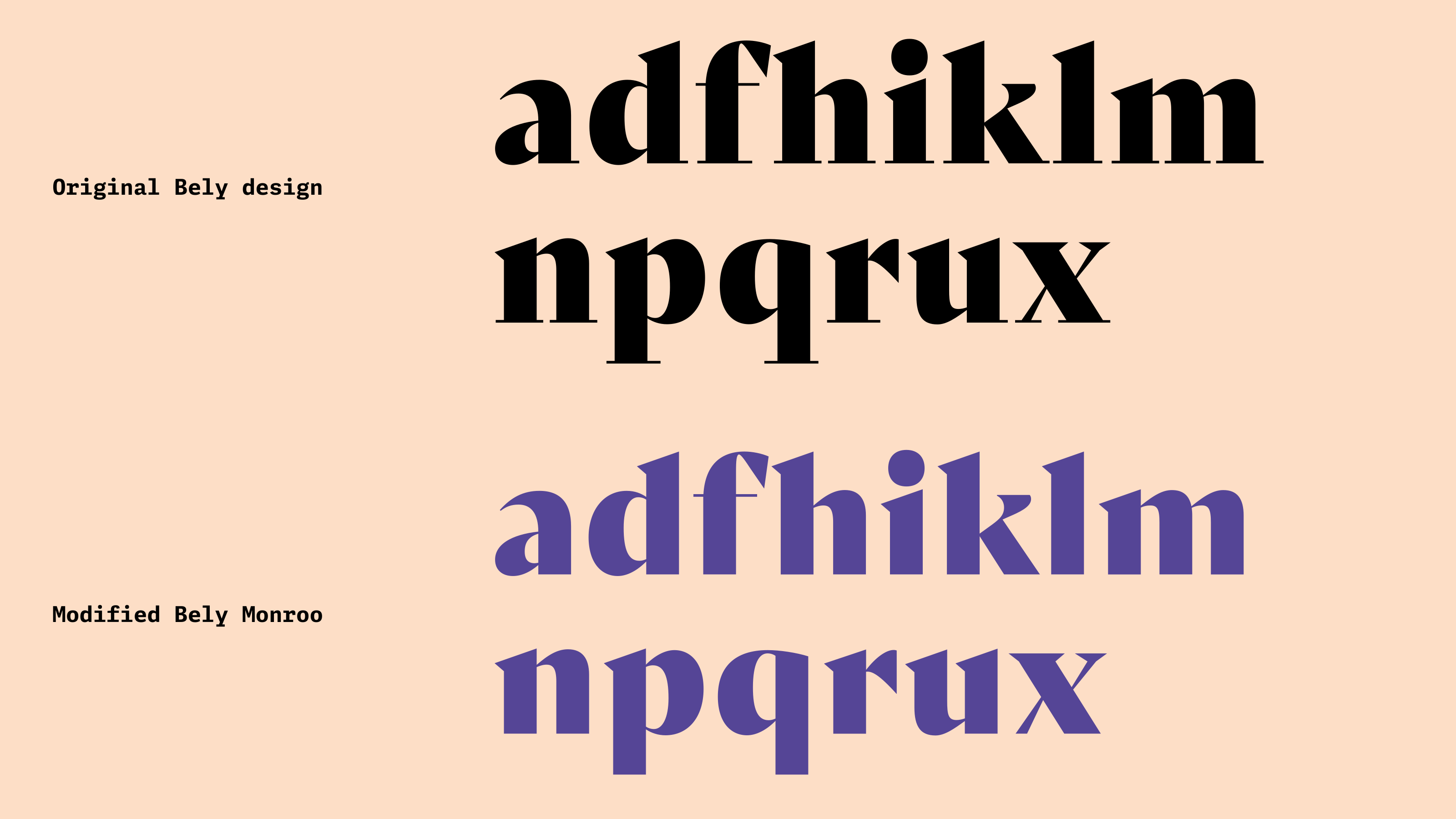
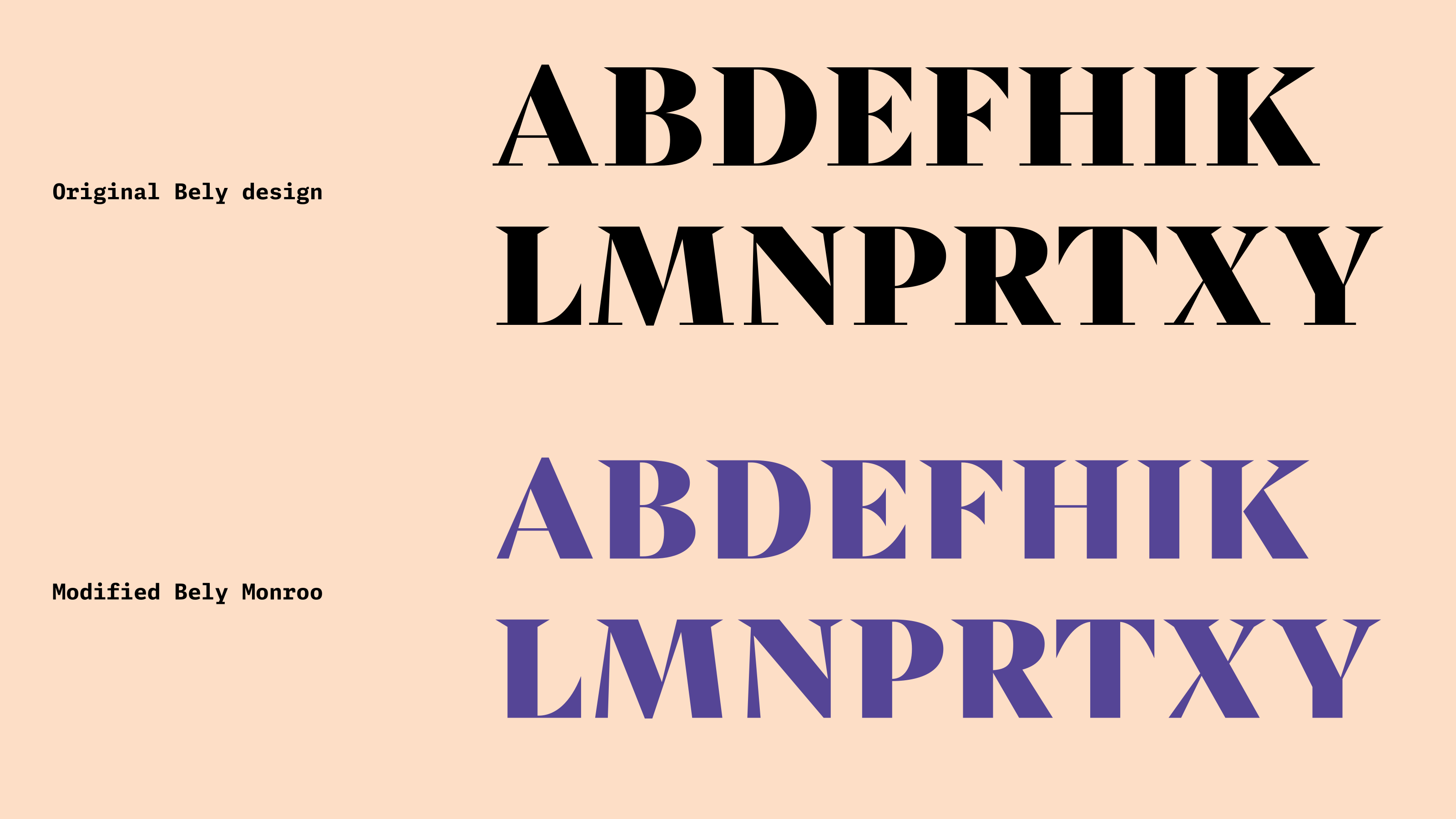
The monroo identity is built around a close relationship between logo and type. At its centre is a customised version of Bely Display, adapted into Bely Monroo for use in headlines, callouts, and expressive brand messaging. The modifications sharpen the connection between the typeface and the logo: the lower serifs were removed from the Bely Display alphabet, giving the headline style a cleaner, more distinctive rhythm while keeping the elegance and contrast of the original typeface.
The most characteristic changes are concentrated in the lowercase r and o, which carry the visual DNA of the monroo logo. The original lowercase “r” was replaced with a custom version whose ball terminal visually corresponds to the scale of the classic Bely dot, allowing it to sit naturally within text settings such as monroo.eu. The lowercase “o” was also replaced with the monroo version, with an additional mirrored alternate added. These alternate “o” forms allow doubled letters to become an active graphic feature rather than a neutral repetition.
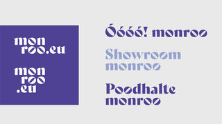
Together, these changes transform Bely from a headline typeface into a brand-specific typographic voice. The customised forms make it possible to extend the monroo logo logic into words, headlines, and short marketing phrases, creating a playful but controlled system. Through OpenType contextual alternates, the typeface can react dynamically to combinations such as “oo”, adjusting the left- and right-leaning forms so the logo’s circular, grape-like, sunlit motif can reappear naturally in typography.
The result is not simply a logo adaptation, but a coherent typographic tool: a modified headline font that carries the monroo identity across print, web, and promotional communication while preserving consistency with the brand’s visual manual.