NRK Super
- Client
- Norsk rikskringkasting
- Project Year
- 2017
- Script
- Latin
- Date
- April 2017
- Type Design and Creative Direction
Go to Veronika Burian TypeTogetherVeronika Burian
Go to José Scaglione TypeTogetherJosé Scaglione
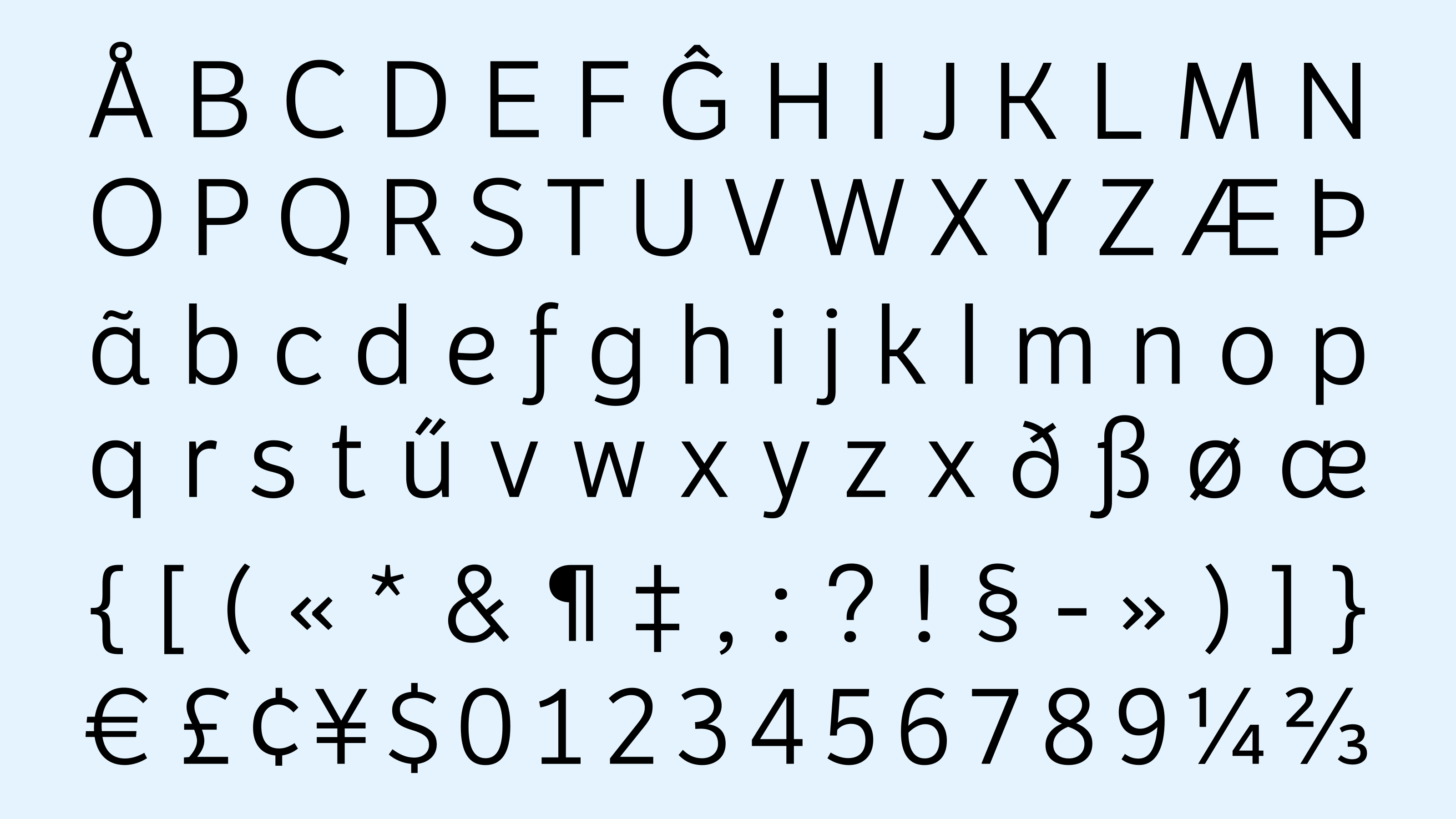
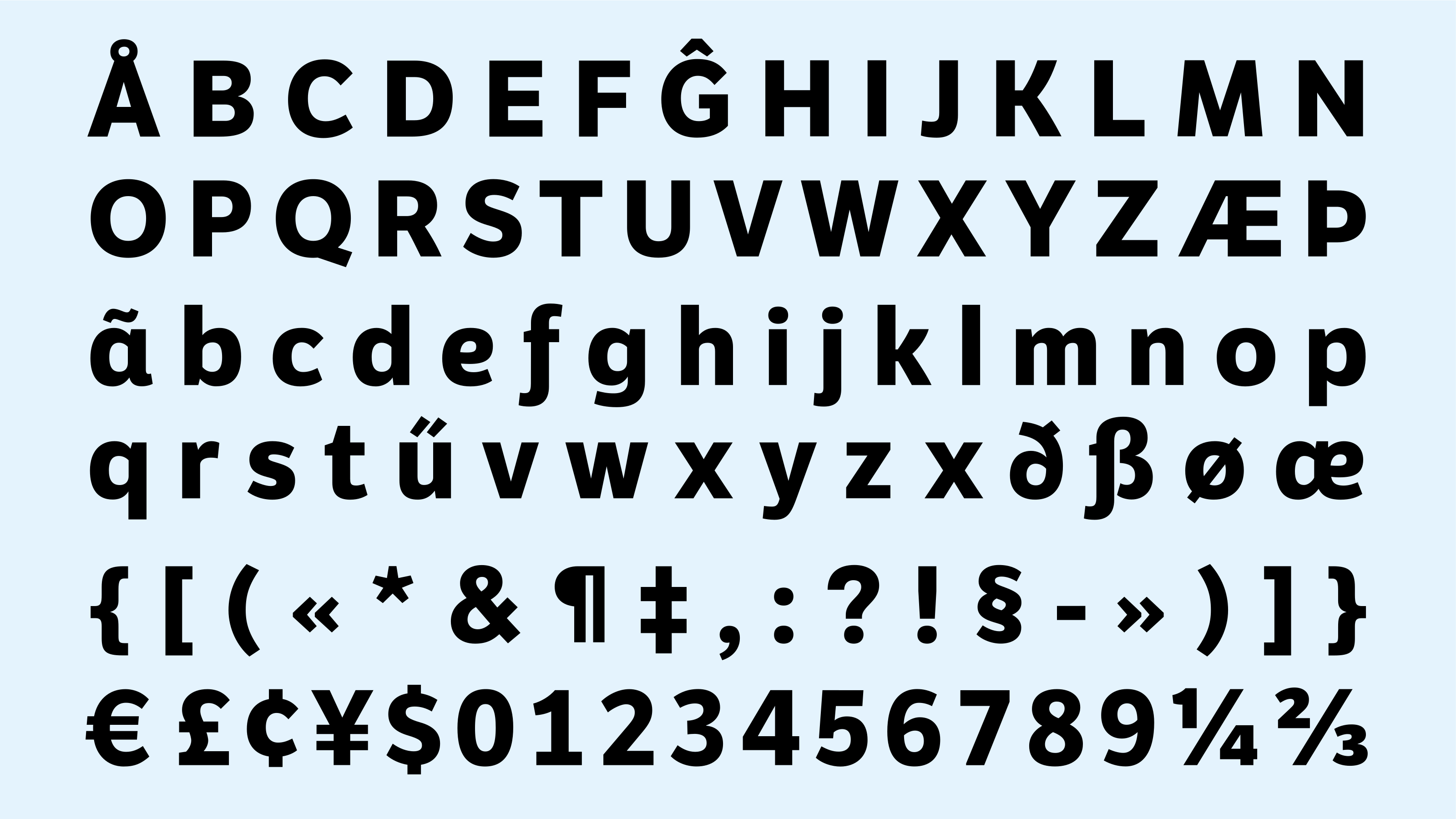
Following the successful development of a bespoke typeface for Norway’s public broadcaster NRK, TypeTogether was invited to create a dedicated typographic voice for its children's channel, NRK Super. The challenge was not to design a children's font, but a font for children—one that feels engaging, optimistic, and full of character while maintaining the clarity, sophistication, and versatility required of a modern broadcast identity.
Brief & Development
Three years after commissioning its corporate typeface, Norwegian public broadcaster NRK once again turned to TypeTogether—this time to create a custom version of LFT Etica for its children's channel, NRK Super. Designing typography for children is a delicate balancing act. It must feel warm, friendly, and engaging without becoming childish, distinctive enough to capture attention yet clear enough to remain highly legible across every medium.
Led by Hilde Jørgenvåg, NRK’s in-house design team provided a remarkably clear and insightful brief that laid the foundation for the project. The new typeface was to remain recognisably part of the LFT Etica family while establishing a unique identity for NRK Super. It needed to perform equally well in web headlines, social media content, and print applications, while introducing a greater sense of personality and expression than its parent family. At the same time, readability remained paramount, as the channel serves children between the ages of two and twelve.
The resulting type family was developed from three LFT Etica styles—Book, Semibold, and Bold—which formed the basis for a more playful yet sophisticated typographic voice. During the early stages of development, NRK also explored the possibility of incorporating a layered effect as an additional expressive feature. While several concepts were tested, the idea was ultimately set aside in favour of a cleaner and more versatile solution.
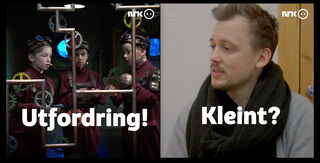
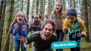
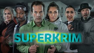
Taking these points into account, it was decided that modifications should happen on two levels. 1. Globally in the whole typeface, because small and subtle changes can have a high and distinct impact, and 2. Glyph-specifically in some key letters with a high repetition rate in Norwegian. To achieve a warmer and friendlier feel without seeming childish, the counters were softened on one side and connections were made smoother. Also, ascenders were made taller to give the font a more airy and pleasant quality.
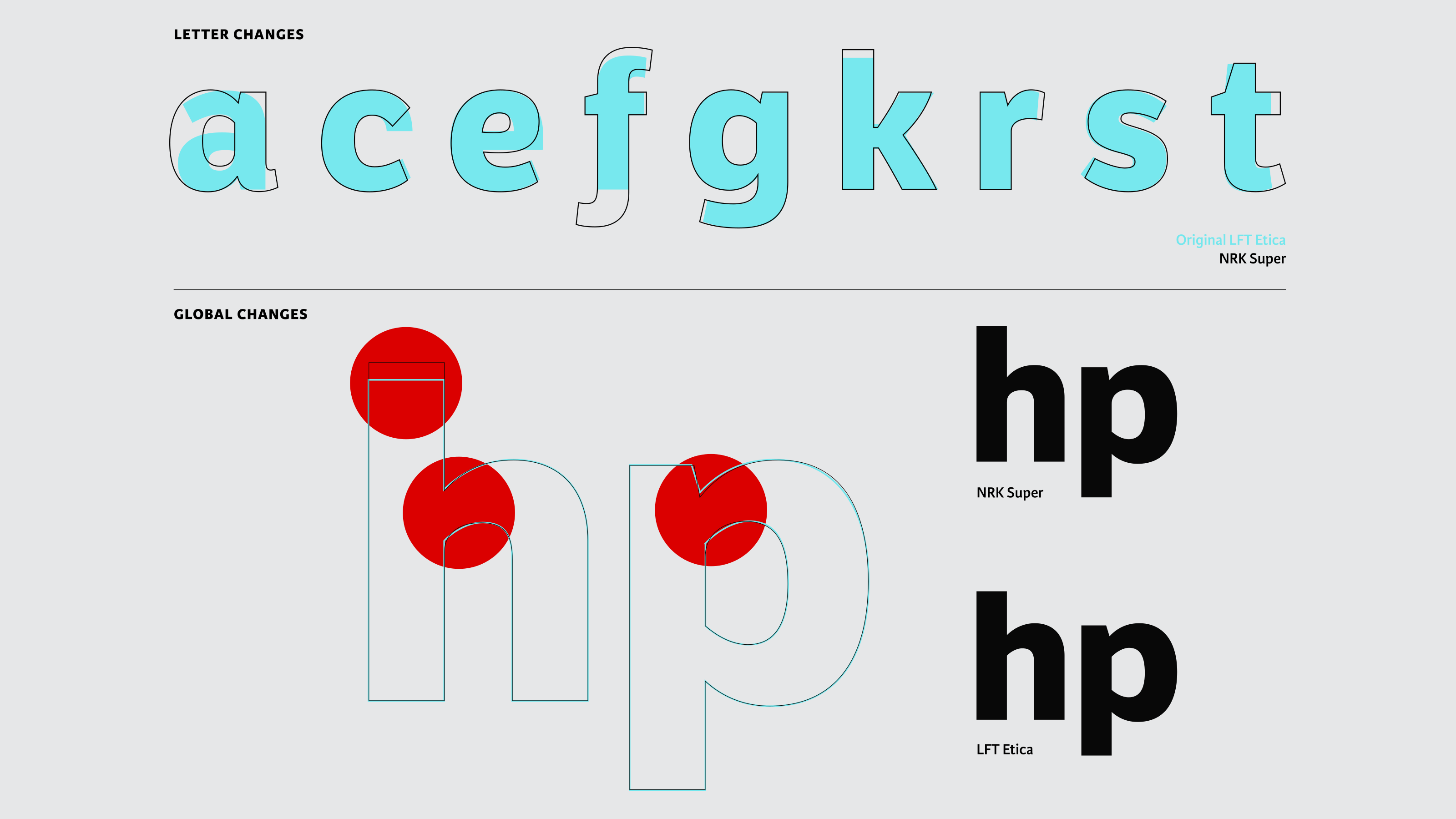
According to character frequency data, the six most common letters are e, n, t, r, a, and i, followed closely by s, g, and k.
Letter-specific modifications
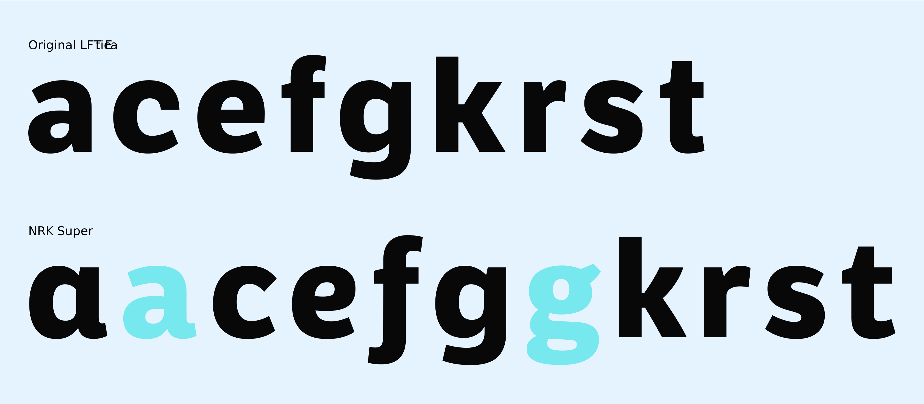
To maximise visual impact while maintaining a close relationship with LFT Etica, the design focused on the letters that appear most frequently in Norwegian. By selectively modifying these key characters, it was possible to significantly influence the overall personality of the typeface without compromising its connection to the original family.
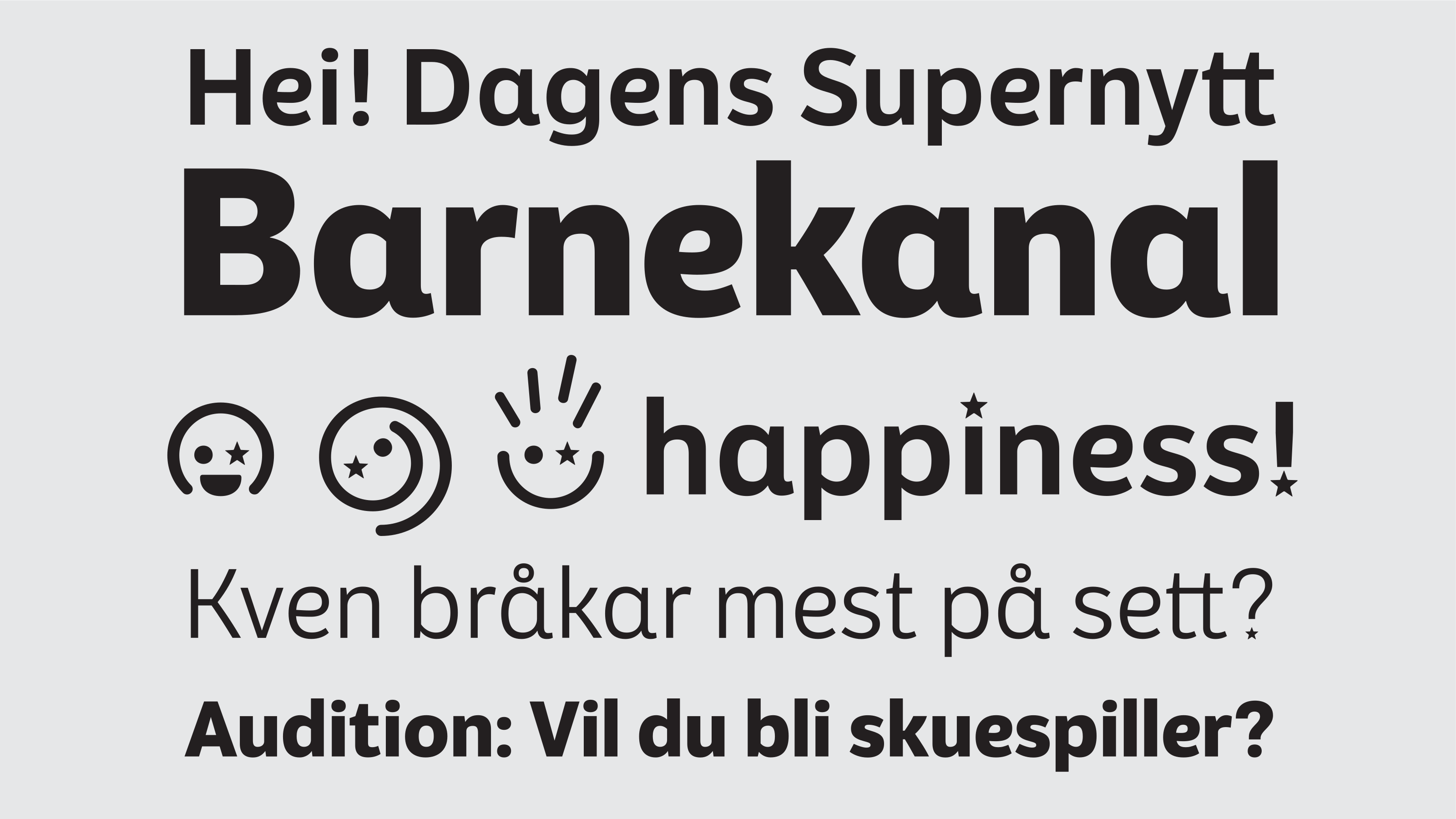
Several letters were given alternate forms and more expressive details. The a and g each received two stylistic options, with the a also featuring an outstroke tail. More open counters in the c and s create a friendlier appearance, while cursive-inspired forms of the e and f introduce a softer, more approachable tone. The k was redesigned with curved legs to add a sense of playfulness, and the r and t were widened to improve both character and readability.
Together, these targeted interventions give NRK Super a distinctive typographic voice that is recognisably its own while remaining firmly rooted in the DNA of LFT Etica.
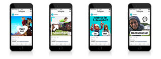
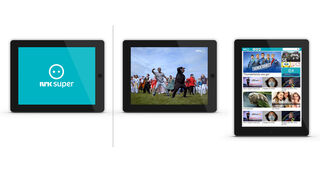
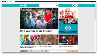
Emojis and Logotype
As part of the channel’s broader rebranding effort, the NRK design team also commissioned a redesign of the NRK Super wordmark. The new logo was drawn from the customised typeface and then carefully refined through adjustments to spacing, weight, and individual letterforms to create a stronger and more cohesive visual identity. The result preserves the recognisability of the original mark while aligning it more closely with the personality of the new typographic system.

Old logotype on the left and new on the right.
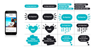
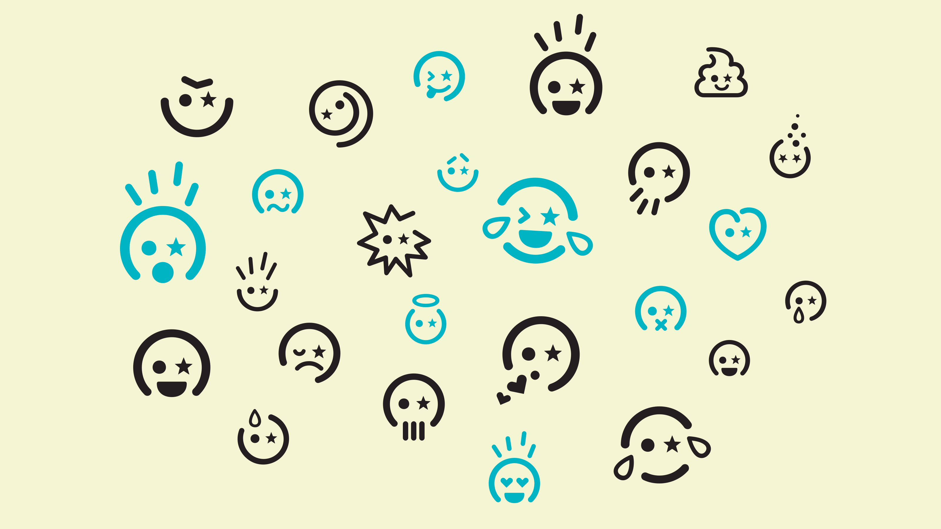
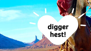
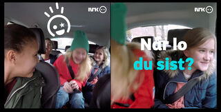
The channel’s existing emoji-inspired logo also became a source of inspiration for a wider set of expressive graphic elements. A collection of custom emojis was developed to complement the identity, designed to be layered with illustrations, photography, and other visual assets across a variety of media. Extending this playful concept into the typeface itself, the iconic star-shaped eyes were incorporated as an alternate stylistic set for punctuation, replacing conventional dots with stars and adding another distinctive detail to the NRK Super brand experience.
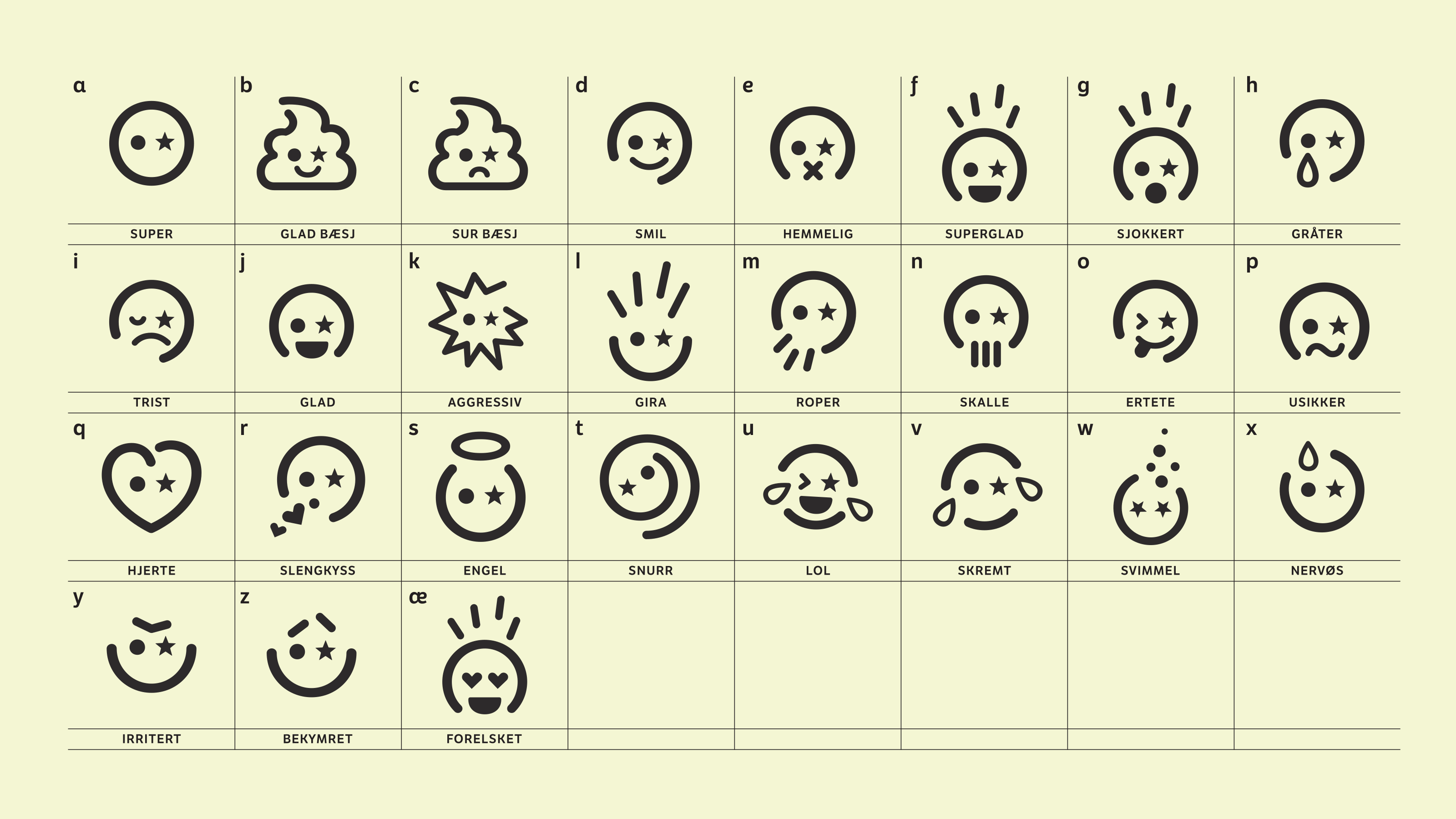
The emojis are available as separate font and as stylistic set within the NRK Super font.