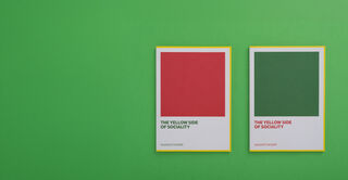
Book Design
The architecture of a book is built with type. For long-form reading, typography must recede gracefully and invisibly, forming a seamless channel for the author’s voice. At the same time, it must enable covers and interiors to rise to the occasion with scholarly authority or artistic flourish. TypeTogether’s book fonts are rooted in classical legibility and refined texture, offering families of exemplary proportion and rhythm that honor the reader’s journey and enhance the permanence of the text.

Readability
Meticulously balanced for seamless, fatigue-free continuous reading across long-form texts.

Typographic niceties
Includes refined typographic features like true small caps, ligatures, and oldstyle figures for editorial polish.

Structural hierarchy
Comprehensive family structures with distinct weights and styles for clear, elegant chapters, subheads, and notes.

Cross-format mastery
Expertly engineered to deliver superior readability and texture in both print and digital editions (e-books).
Abril Text
10 Styles
Adelle
30 Styles
Adelle Cyrillic
14 Styles
Adelle Greek
14 Styles
Adelle Sans Devanagari
7 Styles
Adelle Sans Georgian
14 Styles
Adelle Sans Greek
16 Styles
Adelle Sans Hebrew
7 Styles
