Ronnia


- Styles
- 28
- Weights
- 7
- Variable
- No
- Scripts
Latin - Year
- 2007
- Version
- 1.001
- Tipos Latinos, 2008
- 23rd Brno Biennale of Graphic Design, 2008
- Smashing Magazine, Typefaces for Corporate Design, 2008
- Smashing Magazine, Typefaces for Professional Design, 2008
Ronnia has the kind of personality that performs admirably in headlines but is diffident enough for continuous small text. Seen in design choices such as its space-saving ability, high legibility, and the hospitable tone with which it approaches the reader, Ronnia prides itself in being ready to serve.
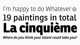
One of the most remarkable characteristics of this humanist sans serif is its versatility. José Scaglione and Veronika Burian’s Ronnia has the kind of personality that performs admirably in headlines, but is diffident enough for continuous and small text alike. From newspaper headlines to web text and corporate business reports, Ronnia satisfies a broad range of applications in an equal range of sizes.
Good type designers create typefaces to solve a specific problem whether that problem is aesthetic, functional, or both. Ronnia was primarily engineered for newspaper and magazine applications. This is seen in design choices such as its space-saving ability, high legibility, and the hospitable tone with which it approaches the reader; Ronnia prides itself in being ready to serve. Toward this end, Ronnia comes in regular and condensed widths that deliver cohesive shapes, a strong impact in the heavier weights, and clear hospitality in the lighter weights.
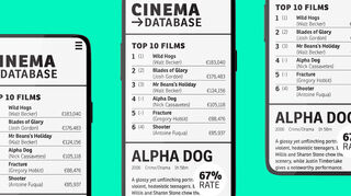
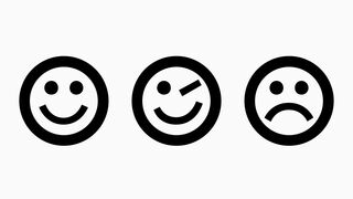
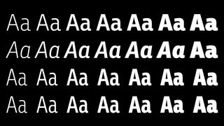
Distinct letterforms help with quick reading, and interesting letterforms cause the reader to want to continue doing so. With this in mind, key glyphs like Ronnia’s ‘a’, ‘c’, ‘e’, ‘l’, ‘s’, ‘M’, and ‘G’ have enough internal space to make recognition easy and enough personality to make reading enjoyable. Ronnia benefits from a mammoth x-height to readily voice captions, tables, and other minutiae. Its 28 styles grant the designer a broad range in text blocks, from coherent colour to texture variations — necessary tools to solve complex problems involving information and editorial design.
Ronnia’s many OpenType features (small caps, arrows, ornaments, ligatures, info-numerals, fractions, arrows, dingbats, superior letters, stylistic alternates, and much more) are focused on two corresponding things: serving its readers and eliminating the problems plaguing editorial designers. The complete Ronnia family, along with our entire catalogue, has been optimised for today’s varied screen uses.
Styles
- Condensed Thin Buy
- Condensed Thin Italic Buy
- Condensed Light Buy
- Condensed Light Italic Buy
- Condensed Buy
- Condensed Italic Buy
- Condensed Semibold Buy
- Condensed Semibold Italic Buy
- Condensed Bold Buy
- Condensed Bold Italic Buy
- Condensed Extrabold Buy
- Condensed Extrabold Italic Buy
- Condensed Heavy Buy
- Condensed Heavy Italic Buy
- Thin Buy
- Thin Italic Buy
- Light Buy
- Light Italic Buy
- Regular Buy
- Italic Buy
- Semibold Buy
- Semibold Italic Buy
- Bold Buy
- Bold Italic Buy
- Extrabold Buy
- Extrabold Italic Buy
- Heavy Buy
- Heavy Italic Buy
Type Testers