About Wood & Digital Type
In 2014 we touched on the first ideas around woodtype and billboard posters from the 19th century. Back then it was a simple fascination with the variety and quirkiness these posters displayed. Around that time we had been invited by Pelle Anderson from Sweden to give a talk about our work as part of a typographic lecture series. When walking around Stockholm, some tabloid newspaper front pages caught our attention.
As is common in tabloids, the headline fonts are dense, dark, and set in all caps to be attention-grabbing. But what was most interesting were the incorporated accents. The ring and dieresis were stuck inside the letter with a white frame around them to allow for very tight line-spacing. In some cases this solution looked rather elegant, but less so in others. Since our font library focus is very much on editorial design, we really liked this option and made a mental note for the future.
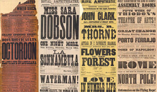
Some late 19th century billboard posters that served as the initial intriguing factor.
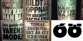
Swedish tabloid newspaper displays found on the streets of Stockholm and a sketch of Catalpa with cut-out diacritics.
In the following months we got distracted with other pressing projects, so this initial idea lay dormant for a few years. At some point though our wish to design a geometric sans serif came back to the forefront and we started drawing.
Geometric sans serifs were always popular, but that trend has increased in recent years. Some branding experts have tried to explain this trend simply as companies ditching their unique logotypes for a more unified, simple, and basic look which could represent any brand message, while surviving in an increasingly digital universe.
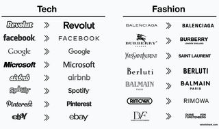
A table showing the trend to simple, geometric logotypes for big brands of the past years.
Not very satisfied or convinced by our first attempts, we remembered the Swedish tabloids and 19th century woodtype grotesques. When we looked at our overall catalogue, we saw a need in our growing font library to design an expressive display headline family for magazines, packaging, posters, and the like. It needed to carry enough personality by introducing a pinch of quirkiness and an unpolished, handcrafted appearance. So we turned again to antique woodtype specimens for inspiration.
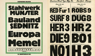
German and American type specimens that served as sources of inspiration.
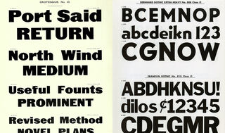
Classic type specimens showing grotesque style type that served as sources of inspiration.
However, given our tendency for text typography, we could not stop at creating just a heavy single style font, and therefore decided to explore the then-very-new variable font format. Would it be possible to create a variable font that went from one extreme to the other and included “text weights” in the middle?
So we designed a thin master and analysed the resulting intermediate weights starting with just one axis (the weight axis). Unfortunately they weren’t appealing or successful due to the necessary stark change of contrast on both extremes of the design space. Because of the higher — and altogether different — set of standards for text typefaces, it would have taken too much tweaking and additional masters (at least for certain glyphs) to make the resulting glyphs work as text styles in the middle.
Letting this frustration dissipate for a while, another thought surfaced. What if the family were expanded in other, less traditional ways, such as with nested words/glyphs, special ligatures, stencils, decorative 3D elements, colour layers, or a fake wood aesthetic? So we set out again to test these options and joined forces with Gui Menga, a talented Brazilian lettering artist we met in Saõ Paulo during ATypI 2015.
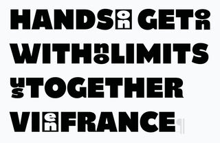
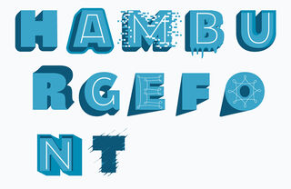
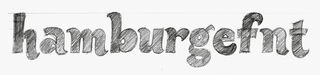
Exploratory ideas by Gui Menga.
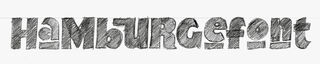
Exploratory sketch by Gui Menga showing special ligatures and nested characters.
Catalpa was made to be an overwhelming headliner, like the quirky and hulking wood type that inspired it. With only four thin and tour heavy weights, being a display family is its single-minded purpose

Experiments remained experiments though. Sadly, none of the ideas were convincing enough to pursue as a fully mature type family, so we returned to the previous intention of a variable font with just one axis. If the middle weights simply wouldn’t work with this family, we decided to put our energy where it would. The difference this time would be to create two variable families at the thin and heavy ends of the spectrum only — going from Hairline to Light and Extrabold to Ultrablack, with nothing in between.
At the same time and as a way to contextualise and save this project, we considered forming a magazine suite of three type families. Even if generally unrelated, from a purely aesthetic point of view we wanted them to be able to be combined successfully in complex editorial designs since each would serve different purposes. Internal comments included such design intentions as, “Low curvature stress (low speed), visible quirkiness in selected characters, clear industrial and mechanical approach, fonts not intended to be used side by side in one line, but instead to provide enough tension among them.”
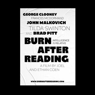
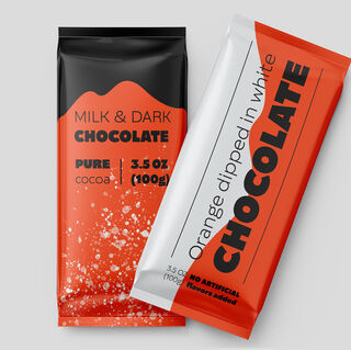
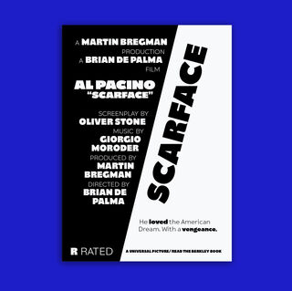
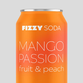
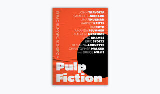
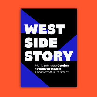
It wasn’t enough that the birth of this project was rather cumbersome, naming the three families was another beast altogether. Catalpa’s original name was “Woody” since it was based on wood type. This triggered the association with the director Woody Allen, which also seemed fitting with his vintage oddball traits. Given the trilogy concept, the other two families were at first named Francis (Ford Coppola) and Quentin (Tarantino). Some intense brainstorming sessions at our 2019 TypeTogether retreat in Italy produced another direction: the first three letters of the alphabet. We agreed on A = Aneto, the highest peak in the Pyrenees, B = Belarius, a character in one of Shakespeare’s plays, and C = Catalpa, a type of tree. And thus the ABC series was born.
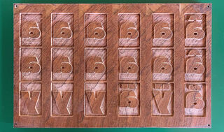
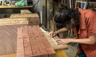
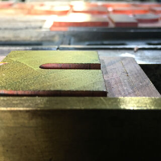
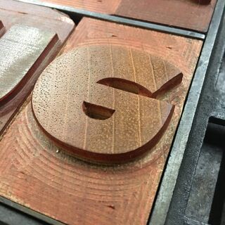
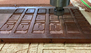
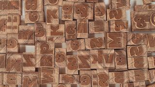
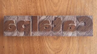
While working on Catalpa in 2018, a talk by Rafael Dietzsch at ATypI Antwerp about his woodtype project in Brazil inspired the idea to tie everything together and create physical wood sorts out of one of Catalpa’s heavy weights. It took us a little while to turn this into reality, but it was worth the wait. You can read about the process and background in an interview we led with Rafael Dietzsch and Rafael Neder here and see the letterpress printed posters here.