Soleil’s dazzling 2026 update
- Date
- June 2026
Wolfgang Homola’s geometric sans has always deserved a second look. Now with its modernisation, its thoughtful, clever design is more relevant than ever.
The Soleil type family was originally created for a wayfinding system in a government building in Vienna, but it soon became clear that the uses for the geometric sans serif family went beyond providing orientation for the Viennese. The type and graphic designer Wolfgang Homola achieved a rare feat by creating a geometric sans with a dynamic, lively design, useful in a variety of contexts, from branding and corporate identity prorgrammes to editorial design. And wayfinding, of course.
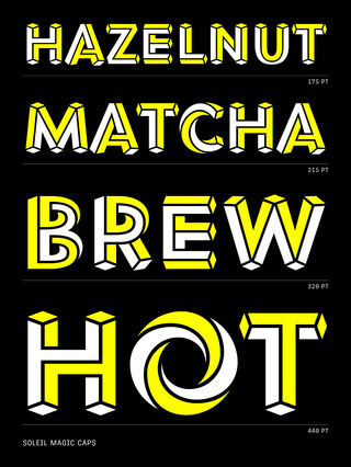
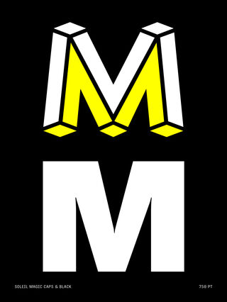
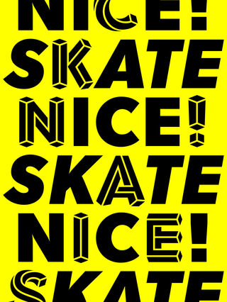
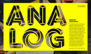
One of Soleil’s most distinguishing characteristics is its MC Escher-like display style called Magic Caps. It’s perfect for branding and merchandising when something eye-catching is required. It truly must be seen to be believed.
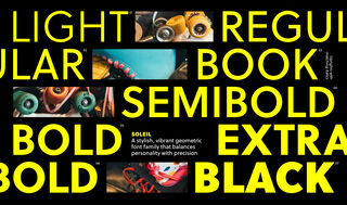
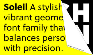
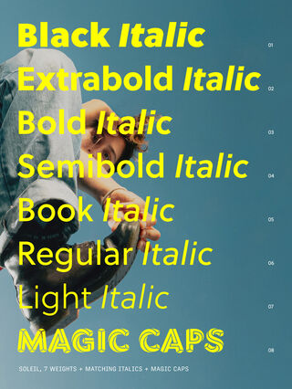
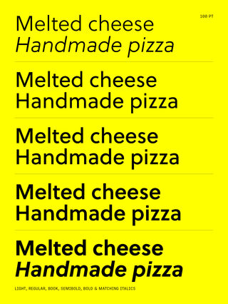
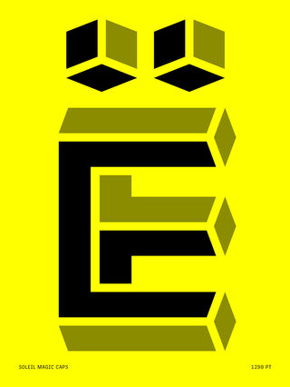
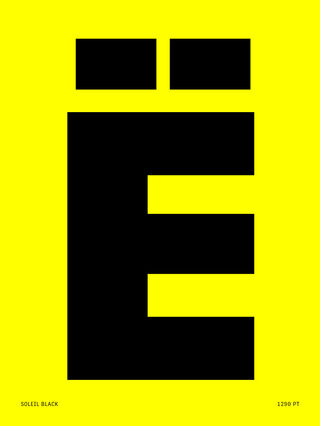

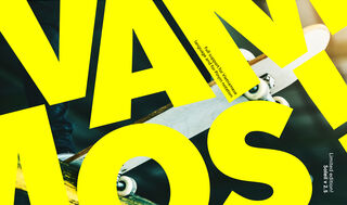
Soleil was first released in 2011, italics and Magic Caps were added in 2015. In 2019 the font was updated again: improved OpenType features, new glyphs, as well as the weight Black and Black Italic, and some not so visible changes: we applied our new Quality Assurance procedure, spacing and kerning were also reviewed, anchors and combining accents were added. In this 2026 update we see more technological updates like variable font.
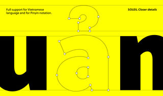
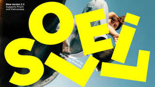
As part of a series of updates we’re releasing throughout 2026, Soleil now has support for Vietnamese and Pinyin notation, as well as a variable font along the weight axis and numerous minor improvements. As with our other 2026 updates, Soleil’s refresh is free to download for existing licence holders.