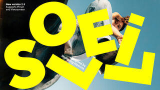
Soleil

- Styles
- 15
- Weights
- 7
- Variable
- Yes
- Scripts
Latin - Year
- 2011
- Version
- Version 2.100
Concept lead Latin
Type design
Engineering
Quality assurance
Kerning
Graphic design
- Rabab Charafeddine
- Elena Veguillas
- Felicia Priscillya
Motion graphics
Copywriting
- Josh Farmer
- Douglas Arellanes
Social media
- ISTD, 2014
- Joseph Binder Award, Silver, 2012
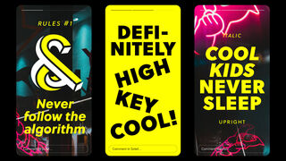
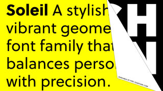
Soleil is a sans serif font family that excels in geometric tranquility. Where other geometric typefaces lean toward the austere or bland, Soleil gives slight hints of a real personality and bring what could have been another tasteless sans into our current time.
Soleil is Wolfgang Homola’s sans serif font family that excels in geometric tranquility. Where other geometric typefaces lean toward the austere or bland, Soleil gives slight hints of a real personality and bring what could have been another tasteless sans into our current time.
Soleil sets itself apart through measured characteristics which recognise its rational heritage and still grant it personality. The circle and square provided the obvious foundation for Soleil’s letterforms, but many optical corrections were necessary in order to introduce more fluidity into the rather stiff concept of a contemporary geometric typeface. These include asymmetrical counters, a lowercase ‘m’ with a second shoulder that meets while the first is still curving, the increased slant on the top of the ‘t’ as the weight increases, and a large x-height for legibility at a distance or in small sizes. Its personality is seen, for example, in the friendly lowercase ‘f’, the perfect curve of the open ‘c’, the large x-height, and the ampersand. The italics were also meticulously designed rather than simply slanted through digital means.
Soleil is based on the modernist ideas of clarity and reduction to essential forms. Its lettershapes, however, are not the result of brute geometric construction, but of a design process that brings together simplicity with fluid rhythm. Soleil fits a wide range of potential applications: signage and wayfinding systems, book and magazine design, branding and corporate publications.
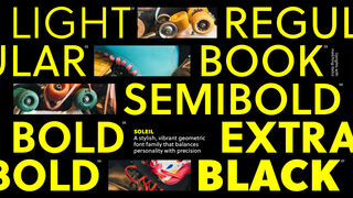
Soleil consists of seven weights with respective italics and a twisting, two-sided Escher-like display style called Magic Caps. Its character set covers over 100 languages that use the Latin script. OpenType features allow for the implementation of typographic niceties such as small caps, both tabular and proportional lining and oldstyle figures, ligatures, alternate characters, case-sensitive variants, and fractions. All together, Soleil’s contemporary and pleasing characteristics make it a great choice to replace overused or unpalatable geometric typefaces. The complete Soleil family, along with our entire catalogue, has been optimised for today’s varied screen uses.
Styles
- Variable Italic From €200.00
- Variable Upright From €200.00
- Soleil Magic Caps Buy
- Light Buy
- Light Italic Buy
- Regular Buy
- Italic Buy
- Book Buy
- Book Italic Buy
- Semibold Buy
- Semibold Italic Buy
- Bold Buy
- Bold Italic Buy
- Extrabold Buy
- Extrabold Italic Buy
- Black Buy
- Black Italic Buy
Type Testers
Italic
Upright