LFT Iro Sans Wayfinding

- Styles
- 18
- Weights
- 8
- Variable
- No
- Scripts
Latin - Year
- 2012
Lead design and concept
Lead design and concept
Engineering
- Joancarles Casasín
- Sonja Stange
Graphic Design
Copywriting
- Josh Farmer
Milan-based Leftloft studio developed the LFT Iro Sans font family from the clear and welcoming wayfinding project of San Siro stadium in Milan. The expansive family solves wide-ranging challenges with an arresting unicase, complementary pictograms, and an assertive text face.
Milan-based Leftloft studio developed the LFT Iro Sans fonts, an expansive family that solves the significant, wide-ranging challenges of branding, wayfinding, pictographic language, and complex editorial use. With its all-encompassing abilities, LFT Iro Sans never finds itself outmatched by the task at hand.
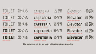
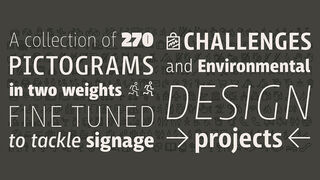
The type family began as the clear and welcoming wayfinding project of San Siro stadium in Milan. The primary aim was to design a technical typeface that was readable in any low visibility condition, such as poorly lit areas with awkward wall shapes and overhangs. This worked well for stadium and large lettering use, but other problems also needed to be addressed, such as complementary iconography. A location developer was left mixing — clashing, really — one type family with a different family of icons, resulting in a cobbled-together look which diluted the brand and the experience. Each icon shape and its meaning were radically simplified, accepting uniqueness as part of the final visual language. LFT Iro Sans pictograms answers the need for having a consistent, wide range of icons, perfectly suited to the text typeface — a first in public spaces.
LFT Iro Sans goes out on a strong branding limb with an attention-demanding unicase style. Each unicase letter is a combination of the lowercase and capital form, quite noticeable in the ‘i’, ‘m’, ‘t’, and unique ‘d’ and ‘b’, balanced by more restrained forms of ‘a’, ‘s’, ‘c’, and ‘e’.
LFT Iro Sans is not only a technical typeface, but, thanks to the letters’ proportions, can also be used for editorial purposes. The text weights are assertive and economical in stature, come with two separate oblique styles (Slanted and Italic), and the Ultralight and Heavy display styles are headline stunners.
For enthusiasts of every stripe, LFT Iro Sans can be a brand’s rallying cry with its arresting unicase, be a developer’s go-to pictogram choice, or set the most demanding editorial text in digital or print. With its many OpenType features, simplified pictogram commands (even available in Apple’s Pages and Microsoft Word), and a total of 38 targeted family members, LFT Iro Sans is a brilliantly sensible choice. The complete LFT Iro Sans family, along with our entire catalogue, has been optimised for today’s varied screen uses.
Styles
- Thin Buy
- Thin Slanted Buy
- Light Buy
- Light Slanted Buy
- Book Buy
- Book Slanted Buy
- Regular Buy
- Slanted Buy
- Semibold Buy
- Semibold Slanted Buy
- Bold Buy
- Bold Slanted Buy
- Extrabold Buy
- Extrabold Slanted Buy
- Black Buy
- Black Slanted Buy