Aneto Skyline


- Styles
- 36
- Weights
- 6
- Variable
- Yes
- Scripts
Latin - Year
- 2022
Type Design
Engineering
Quality assurance
Kerning
Graphic design
- Rabab Charafeddine
- Felicia Priscillya
- Elena Veguillas
Motion graphics
Copywriting
- Josh Farmer
- ED-Awards, Bronze, 2023
- Hiiibrand Awards, Bronze, 2024
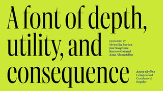
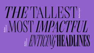
As one of Aneto’s three subfamilies, Aneto Skyline is 36 fonts in a three-width power display, able to arrest the fickle eyes of viewers with the tallest, most impactful, and enticing headlines.
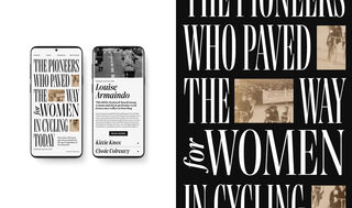
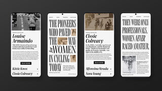
José Scaglione and Veronika Burian bring the Aneto Skyline serif font family to the forefront of every page it graces. Front pages — above the fold and before the scroll — have as their one purpose to arrest the wandering eyes of viewers and entice them to read further. Aneto Skyline takes this precise role seriously and makes the strongest aesthetic and informational impression. Compared to the rest of the Aneto family, it is neither overly clever nor too simple, but a direct display of power in three widths.
Because of its myriad intended uses, the three pillars of the Aneto family took over three years to complete. Aneto Skyline was specifically created to set the tallest, most impactful headlines in the compressed spaces of magazines, posters, and newspapers. Its height, contrast, and sheer presence commands attention and ensures a headline that reverberates with news harrowing or hopeful.
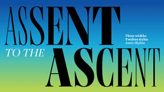
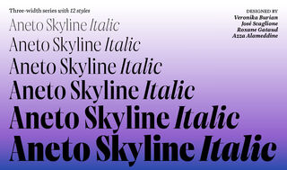
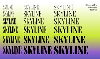
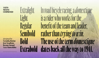
Aneto Skyline’s features flow from its overall intention, slender structure, and confident style. Naturally, its pinpointed purpose means it has a more concentrated character set than Aneto and Aneto Text, but its six upright and six italic styles are multiplied across three widths each (Condensed, Compressed, Normal) for a total of 36 fonts for maximum impact.
Like its forebears of the early 1900s, the Aneto family has a taller x-height and enlarged counters for better readability, but shortened ascenders and descenders to pack in more letters per line. Other details further increase the message’s impression with alternate sharp serif transitions on ‘C, G, S’ and sharpened angles on wedged alternates ‘A, M, N, V, W’. And marvel at the heaviest styles of Q with its carve-out for clarity.
The two main typographic design problems begging to be solved are reducing file size and adding more style options. So Aneto Skyline optionally groups all 36 static styles into just two variable fonts, using only a fraction of the space. The future is variable and TypeTogether has been producing variable fonts since 2017.
The entire Aneto family is the third within a trilogy, with Catalpa being the first and Belarius the second. Each of the three have a distinct purpose and their own look, but they serve a common goal as a combinatory suite covering an editorial’s wide array of needs. Seen as a piece of textual architecture such as a mansion, Catalpa is the oversized, impressive, and illuminated profile; Belarius is the primary material undergirding the structure; and Aneto, with its three subfamilies, governs everything from the flow and use of space to the details seen within this mansion. Like an oversized door when slammed, Aneto Skyline’s presence carries the greatest textual resonance.
Styles
- Variable Upright From €199.00
- Variable Italic From €199.00
- Condensed Extralight Buy
- Condensed Extralight Italic Buy
- Condensed Light Buy
- Condensed Light Italic Buy
- Condensed Regular Buy
- Condensed Italic Buy
- Condensed Semibold Buy
- Condensed Semibold Italic Buy
- Condensed Bold Buy
- Condensed Bold Italic Buy
- Condensed Extrabold Buy
- Condensed Extrabold Italic Buy
- Extralight Buy
- Extralight Italic Buy
- Light Buy
- Light Italic Buy
- Regular Buy
- Italic Buy
- Semibold Buy
- Semibold Italic Buy
- Bold Buy
- Bold Italic Buy
- Extrabold Buy
- Extrabold Italic Buy
- Compressed Extralight Buy
- Compressed Extralight Italic Buy
- Compressed Light Buy
- Compressed Light Italic Buy
- Compressed Regular Buy
- Compressed Italic Buy
- Compressed Semibold Buy
- Compressed Semibold Italic Buy
- Compressed Bold Buy
- Compressed Bold Italic Buy
- Compressed Extrabold Buy
- Compressed Extrabold Italic Buy
Type Testers
Upright
Italic