Archibrazo

- Styles
- 13
- Weights
- 7
- Variable
- Yes
- Scripts
Latin - Year
- 2026
Type design
Engineering
Graphic design
- Rabab Charafeddine
- Felicia Priscillya
- Elena Veguillas
Motion design
Copywriting
Technical advisor
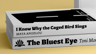
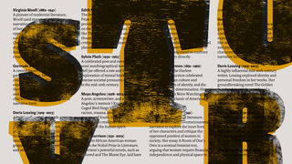
Master type designer Rubén Fontana's Archibrazo serif family combines calligraphy with sculpture for maximum readability. Its seven weights optimise readability with sculptural wedge serifs and carved countershapes, and the Archibrazo Rotunda weight excels in uses such as titling, branding, and posters.
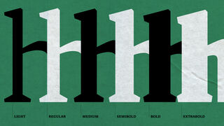
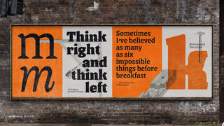
Calligraphy combines with sculpture in master type designer Rub.n Fontana’s Archibrazo, a serif type family designed with effortless readability in mind. With seven weights and a wealth of typographic refinements, Archibrazo delivers a balance of rich texture and typographic colour in paragraphs and striking impact in titles.
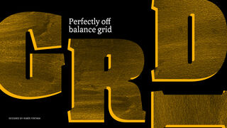
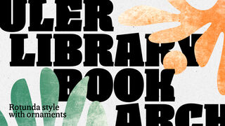
In its lighter weights, Archibrazo is an excellent editorial typeface that enables comfortable continuous reading through a deftly efficient use of space and an exuberant yet pleasant texture. In its heavier weights, letter shapes gain weight without taking on a lot of width. The letters sit together closely but never feel crowded. Fontana masterfully takes the design to its limits with Archibrazo Rotunda, a titling poster style where the sculptural feel of the font comes together with countershapes that feel carved into the letters. Due to their compact nature, Archibrazo Extrabold and Rotunda are excellent for branding and signage.
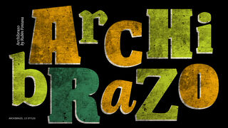
Archibrazo is Rub.n Fontana’s latest typeface, and in it he pays homage to the influential painter, printer, and surrealist Juan Andralis’ renowned Buenos Aires publishing house, El Archibrazo, which played a crucial role in promoting surrealism in Latin America. The Archibrazo type family emerged from Fontana’s research into readability optimisation, something it shares with his Chaco type family, released by TypeTogether in 2024.
Every glyph in Archibrazo invites you into a brilliant play of shape and countershape – a dance of presence and absence where wedge serifs emerge only to recede in moments of elegant restraint. Discretionary ligatures are woven in as a thoughtful embrace of language, and details like the slanted apex of the A are crafted to be both memorable and harmonious. In setting, the family delivers a striking yet serene tactile presence, connecting the reader to a lineage of form while offering features that keep it oriented toward the future.
Archibrazo comes in 13 styles and packs an impressive toolbox of typographic niceties including small caps, five sets of figures, discretionary ligatures, a wide range of fleurons, and much more. It can be purchased under a perpetual license directly from TypeTogether, including for web fonts and use in applications such as games and mobile apps.
Styles
- Variable Italic From €159.00
- Variable Upright From €159.00
- Light Buy
- Light Italic Buy
- Regular Buy
- Italic Buy
- Medium Buy
- Medium Italic Buy
- Semibold Buy
- Semibold Italic Buy
- Bold Buy
- Bold Italic Buy
- Extrabold Buy
- Extrabold Italic Buy
- Rotunda Buy
Type Testers
SCULPTURE
EXUBERANCE
COUNTERSHAPES
Ta robe sur le tapis
Et toi dans mon lit
Doux présent du présent
Fraîcheur de la nuit
Chaleur de ma vie.
Italic