Atlante


- Styles
- 18
- Weights
- 9
- Variable
- Yes
- Scripts
Latin - Year
- 2022
Quality Assurance
Engineering
Kerning
Graphic Design
- Rabab Charafeddine
- Elena Veguillas
- Felicia Priscillya
Motion Graphics
Social Media
Copywriting
- Josh Farmer
- Clap Platinum Award, Best headline font, 2022
- ED Awards, Gold, 2023
- TDC, Certificate of Typographic Excellence, 2022
- Tipos Latinos 9, Certificate of Typographic Excellence, 2023
- D&AD, Typeface Family, 2023
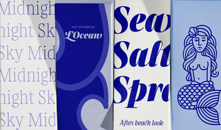
Emotional typefaces are hard to come by in the ‘serious serif’ category. Atlante fills this need with display and text versions, a tenacious italic, and more swashes, alternates, and ligatures than the average font family considers having. Conventional but excessive in all the best ways.
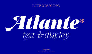
Introducing the Atlante font family, a serif typeface of beautiful excess from Yorlmar Campos and Martín Sesto. Just as a handsaw and a hammer can together build something better than either could alone, different tools used for different reasons can often create a final hybrid product better inclined for more uses. This was the thought behind Atlante: the two writing tools of the flat pen and flexible pen, normally used for different purposes, informed its design to make it more aesthetic. Thus, Atlante taps into the rich typographic and stylistic history of baroques, Garaldes, transitional, and modern categories, while still being its own thing. It’s the definition of a perfectly blended family.
The first thing likely noticed is the sharpness and precision of Atlante’s forms, which makes sense, as it originally stemmed from the idea of an italic-only family. Care was taken with the extreme weights and delicate contrast to maintain its sophistication in pixel and on paper.
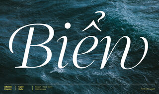
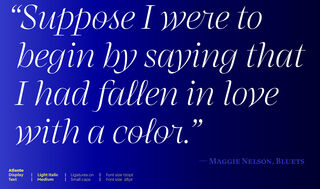
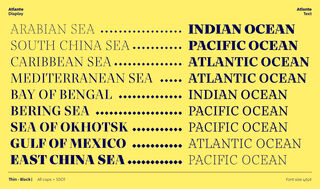
The entire family feels comfortingly familiar while being a fresh take on a text and display companion. The text styles are straightforward and slightly blunted to hold up well in small sizes. The display styles push the ideas to either edge: more contrast, sharper, more flowing, more presence. Compare the ‘a, s’ in both styles to see it transition from svelte to sturdy. And if you want to see it transition with modern technology right in front of your eyes, opt for the variable font instead of the OTF.
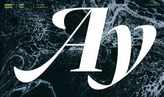
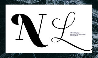
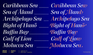
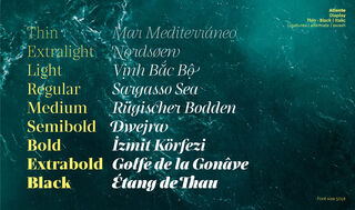
With stylistic sets galore and enough personality for days, it’s the very definition of malleable. The spur on the ‘G’ is serious business with a storied history. For more eye candy, check out the dollop ligature on ‘e–r’, swashes for almost every capital letter, and alternate characters to dial in a precise tone. Not to mention the stunning italics, their alternate characters, and their abounding ligatures and swashes.
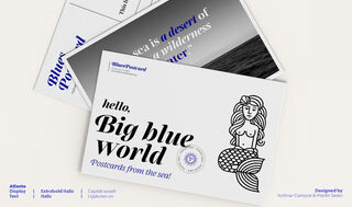
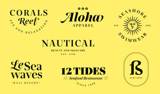
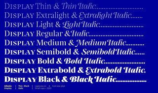
Atlante comes in either 36 styles (18 display and 18 text) or two technologically advanced variable fonts — enough to set a magazine, book, logo, or poster, and more than enough to ensure brand recognition on your corner of the internet. The Atlante family is an excessive, emotional, yet conventional serif for text and display.
Styles
- Variable Upright From €398.00
- Variable Italic From €398.00
- Display Thin Buy
- Display Thin Italic Buy
- Display Extralight Buy
- Display Extralight Italic Buy
- Display Light Buy
- Display Light Italic Buy
- Display Regular Buy
- Display Italic Buy
- Display Medium Buy
- Display Medium Italic Buy
- Display Semibold Buy
- Display Semibold Italic Buy
- Display Bold Buy
- Display Bold Italic Buy
- Display Extrabold Buy
- Display Extrabold Italic Buy
- Display Black Buy
- Display Black Italic Buy
Type Testers
Upright
Italic