Ebony


- Styles
- 18
- Weights
- 8
- Variable
- Yes
- Scripts
Latin - Year
- 2015
- Version
- 2.500
Type design
Engineering
Graphic design
- Elena Veguillas
- Felicia Priscillya
- Rabab Charafeddine
Motion graphics
Copywriting
- Josh Farmer
- Douglas Arellanes
Social media
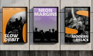
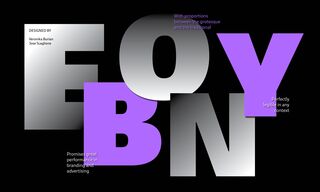
A multi-functional type family, Ebony remains true to TypeTogether’s focus on stylish typographic answers for the complex needs of printed and digital works. Ebony promises great performance in branding and advertising with its dark weights and taut, powerful curves. In short, Ebony is a daringly bold sans serif, now with support for Vietnamese.
Some typefaces need time to ripen. Veronika Burian and José Scaglione made the first sketches for Ebony back in 2008, but it took a few years of maturing in a drawer to be developed into a multi-functional type family. Ebony remains true to TypeTogether’s focus on stylish typographic answers for the complex needs of magazines, newspapers, and books, whether printed or digital. Additionally, Ebony goes far beyond editorial use and promises great performance in branding and advertising.
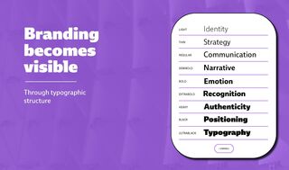
Ebony’s range of dark weights with taut and powerful curves can boost any headline, while the lighter weights create an approachable and clean feel in blocks of continuous text. Ebony does not fall short in aiding legibility either. Letterforms have a distinct direction of ductus, a wide overall stance, and features like the top serif on the lowercase ‘l’ help make glyphs clearly distinguishable from each other.
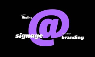
Ebony is a type family that cleverly seeks a balance between the openness and legibility of humanist sans serifs and the striking and more regularised character of grotesques. The lettershapes feature generous counters and open terminals with crisp angles, both of which daringly grow in colour and width as the typeface increases in weight. Beginning from this position of strength, Ebony also shows a quirky side in some of its shapes: the vertical fractions, the @ symbol, the oldstyle numbers, and the short descenders. Its character set has been significantly expanded to include the tonal Vietnamese alphabet, German eszett, and others.
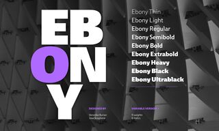
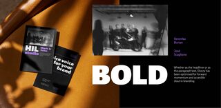
The predominantly slanted style of Ebony’s italics is broken up by some letters that are more in line with the classic cursive appearance, such as ‘a’, ‘e’, ‘f’, and ‘l’. This, together with a forceful italic angle, ensure a change in texture within a block of text, despite sharing the same weight and width as the upright letters. The complete multilingual family comes in 18 digitally dutiful and print-prepared styles that tend toward the heavier part of the weight spectrum. Whether as the headliner or as the paragraph text, Ebony has been optimised for forward momentum and approachable clout in branding.
Styles
- Variable Upright From €315.00
- Variable Italic From €315.00
- Thin Buy
- Thin Italic Buy
- Light Buy
- Light Italic Buy
- Regular Buy
- Italic Buy
- Semibold Buy
- Semibold Italic Buy
- Bold Buy
- Bold Italic Buy
- Extrabold Buy
- Extrabold Italic Buy
- Heavy Buy
- Heavy Italic Buy
- Black Buy
- Black Italic Buy
- Ultrablack Buy
- Ultrablack Italic Buy
Type Testers
Furious is not noise.
It is the moment before control,
when movement overtakes intention
and speed becomes a form of expression.
Upright
Italic