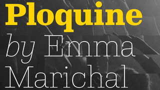
Ploquine

- Styles
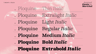
- 14
- Weights
- 7
- Variable
- Yes
- Scripts
Latin - Year
- 2024
Supervision
Engineering
Quality assurance
Graphic design
- Elena Veguillas
- Felicia Priscillya
- Rabab Charafeddine
Motion graphics
Copywriting
- Josh Farmer
Social media
- Gerard Unger Scholarship, 2022
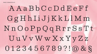
Designed from wood types for editorial use, Ploquine can be aggressive or delicate. Its 14 well-balanced styles are suitable for paragraphs where its details improve the overall text colour, and they become a distinctive branding feature when set at large sizes.
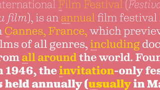
Based on historical typefaces made of wood, Emma Marichal’s Ploquine font family is a calm and structured slab serif for everything editorial and branding. Designers need a few trustworthy slab serifs in their toolbox, including one that will always feel modern, be able to speak with multiple voices, and works in many digital and analogue situations. With Ploquine’s ability to be assertive and delicate, this family will become your go-to for years to come.
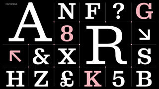
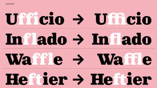
Wood types and slab serifs originally converged in design out of the necessity for inexpensive materials and to be captivating. Ploquine now adds a few more objectives: a modern feel, thinner styles that are aesthetically refined, heavier styles that emphasise their squarish forms, curved serif connections, and italics that ride the line between attitudinal and forthright. Unusual horizontal endings (a, t) give text a forward rhythm, while Ploquine’s extra-large capitals, punctuation, and serifs are treated as overall style partners. Designers should use this typeface to give the reader a sense of calm-fidence, and its stability should guide readers.
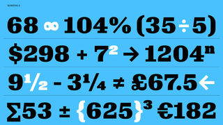
Balanced sturdiness with delicate details make Ploquine suitable for headings and medium to long texts. The slightly squarish character of the lighter weights set each glyph’s parameters so each heavier weight grows into its serifs and the whitespace contained within. The weights above medium mimic a wood type look with their flattened internal counters and decreased contrast. Other details include a paragraph symbol grounded by a foot serif and simplified monetary symbols in heavy weights. Delicate italics complement Ploquine’s upright styles to reinforce the refined end of the spectrum. Some baseline serifs are lost (h, k, l, m, n, r) while other serifs remain (S, 7), bringing enough cursiveness to distinguish itself without creating an attention clash.
Ploquine is an amenable design in a broad 14-style aesthetic range, with additional display styles upcoming. It is suitable for magazine paragraphs, museum catalogues, art information tags, headlines, logotypes with a refined presence, and poster-sized text to reveal its hidden details. Generous in aesthetics, proportions, and tone, Ploquine knows when to give and when to take — it is the confident space-taker in heavier styles and happily cedes territory as the unnoticed background context in the other styles.
Styles
- Variable Upright From €169.00
- Variable Italic From €169.00
- Thin Buy
- Thin Italic Buy
- Extralight Buy
- Extralight Italic Buy
- Light Buy
- Light Italic Buy
- Regular Buy
- Italic Buy
- Medium Buy
- Medium Italic Buy
- Bold Buy
- Bold Italic Buy
- Extrabold Buy
- Extrabold Italic Buy
Type Testers
Upright
Italic