Tablet Gothic


- Styles
- 84
- Weights
- 7
- Variable
- Yes
- Scripts
Latin - Year
- 2012
Type design
Engineering
Quality assurance
Graphic design
- Elena Veguillas
- Felicia Priscillya
- Rabab Charafeddine
Motion graphics
Copywriting
- Josh Farmer
Social media
- Typographica’s Best Typefaces, 2012
- ED Awards, Silver, 2013
- Yearbook of Type I, 2013
- TDC Tokio Exhibition, 2013
- Clap Awards, 2013
- Tipos Latinos, 2014
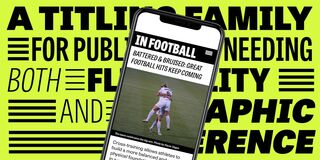
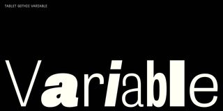
Tablet Gothic is a sans serif family for digital and print publications needing both flexibility and graphic coherence amidst dense amounts of information. It delivers the sturdy, straightforward, and clean appearance expected from a grotesque while allowing its personality to stand out on the page. Whatever the need, Tablet Gothic’s exhaustive 84 styles (or infinite variable font styles) perform well both technically and aesthetically.
Graphic designers know well that the art of composing titles and paragraphs correctly is not easy, especially when it comes to publications needing both flexibility and graphic coherence amidst dense amounts of information. Tablet Gothic was engineered by Veronika Burian and José Scaglione for publications simultaneously released digitally and in print. As such, it is a grotesque sans serif that looks to the future of digital publishing with a clear understanding of its analogue history.
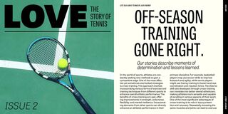
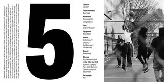
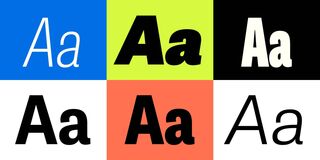
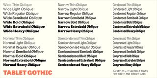
Tablet Gothic delivers the sturdy, straightforward, and clean appearance expected from a grotesque grounded in 19th century Britain and Germany, and allows itself a good measure of personality to stand out on the page. Its exhaustive 84 styles — six series of widths and seven weights in each series, plus matching obliques — guarantee that, whatever the need, there’s at least one Tablet Gothic style that performs well both technically and aesthetically. Its almost-vertical axis is one key allowing Tablet Gothic to come in a wide range of styles without losing its signature look. The Wide, Normal, and Narrow widths therefore produce a beautiful texture and highly readable text blocks at small sizes.
Many grotesque typefaces suffer in several ways. They often have unresolved or competing terminals, vertical emphasis, inexplicable stroke contrast, general clunkiness, a shortage of internal space in their heavier weights, and therefore lack fundamental movement through words. What at first is celebrated as their quirks are in fact a problem for readability because these qualities stop the eye at almost every letter. But set the word ‘gears’ in Tablet Gothic and notice the subtle line that angles up and to the right through an interplay of internal space and diagonal terminals. This quality pushes the reader’s eye through one sentence and on to the next, masterfully avoiding the previously mentioned pitfalls. It is particularly compelling in Tablet Gothic’s semibold and heavier weights since the terminals have more definition and are a large part of this visual propulsion.
Tablet Gothic’s flexibility and voice make it a solid progression from the clunky, tepid, or less readable grotesque typefaces that are chosen because they are safe. Tablet Gothic is better than safe; it is pleasing and comprehensive, making it perfect for branding or in long texts. Tablet Gothic’s character set covers well over 200 languages that use the Latin extended alphabet. Each style features ligatures, lining and tabular lining figures, arbitrary fractions, superiors/inferiors, and numerators/denominators. The complete Tablet Gothic family has been optimised for today’s varied screen uses, comes in the variable font format for infinite style options or as static OpenType styles, and can be purchased individually, by series, or as a complete bundle.
For the greatest and most professional impact, pair Tablet Gothic with its intended counterpart, Abril, the credible, contemporary interpretation of a classic newsface.
Styles
- Variable Upright From €298.00
- Variable Oblique From €298.00
- Compressed Thin Buy
- Compressed Thin Oblique Buy
- Compressed Light Buy
- Compressed Light Oblique Buy
- Compressed Regular Buy
- Compressed Oblique Buy
- Compressed Semibold Buy
- Compressed Semibold Oblique Buy
- Compressed Bold Buy
- Compressed Bold Oblique Buy
- Compressed Extrabold Buy
- Compressed Extrabold Oblique Buy
- Compressed Heavy Buy
- Compressed Heavy Oblique Buy
- Condensed Thin Buy
- Condensed Thin Oblique Buy
- Condensed Light Buy
- Condensed Light Oblique Buy
- Condensed Regular Buy
- Condensed Oblique Buy
- Condensed Semibold Buy
- Condensed Semibold Oblique Buy
- Condensed Bold Buy
- Condensed Bold Oblique Buy
- Condensed Extrabold Buy
- Condensed Extrabold Oblique Buy
- Condensed Heavy Buy
- Condensed Heavy Oblique Buy
- Semicondensed Thin Buy
- Semicondensed Thin Oblique Buy
- Semicondensed Light Buy
- Semicondensed Light Oblique Buy
- Semicondensed Regular Buy
- Semicondensed Oblique Buy
- Semicondensed Semibold Buy
- Semicondensed Semibold Oblique Buy
- Semicondensed Bold Buy
- Semicondensed Bold Oblique Buy
- Semicondensed Extrabold Buy
- Semicondensed Extrabold Oblique Buy
- Semicondensed Heavy Buy
- Semicondensed Heavy Oblique Buy
- Light Buy
- Light Oblique Buy
- Bold Buy
- Bold Oblique Buy
- Extrabold Buy
- Extrabold Oblique Buy
- Heavy Buy
- Heavy Oblique Buy
- Thin Buy
- Thin Oblique Buy
- Regular Buy
- Oblique Buy
- Semibold Buy
- Semibold Oblique Buy
- Narrow Thin Buy
- Narrow Thin Oblique Buy
- Narrow Light Buy
- Narrow Light Oblique Buy
- Narrow Regular Buy
- Narrow Oblique Buy
- Narrow Semibold Buy
- Narrow Semibold Oblique Buy
- Narrow Bold Buy
- Narrow Bold Oblique Buy
- Narrow Extrabold Buy
- Narrow Extrabold Oblique Buy
- Narrow Heavy Buy
- Narrow Heavy Oblique Buy
- Wide Thin Buy
- Wide Thin Oblique Buy
- Wide Light Buy
- Wide Light Oblique Buy
- Wide Regular Buy
- Wide Oblique Buy
- Wide Semibold Buy
- Wide Semibold Oblique Buy
- Wide Bold Buy
- Wide Bold Oblique Buy
- Wide Extrabold Buy
- Wide Extrabold Oblique Buy
- Wide Heavy Buy
- Wide Heavy Oblique Buy
Type Testers
Upright
Oblique